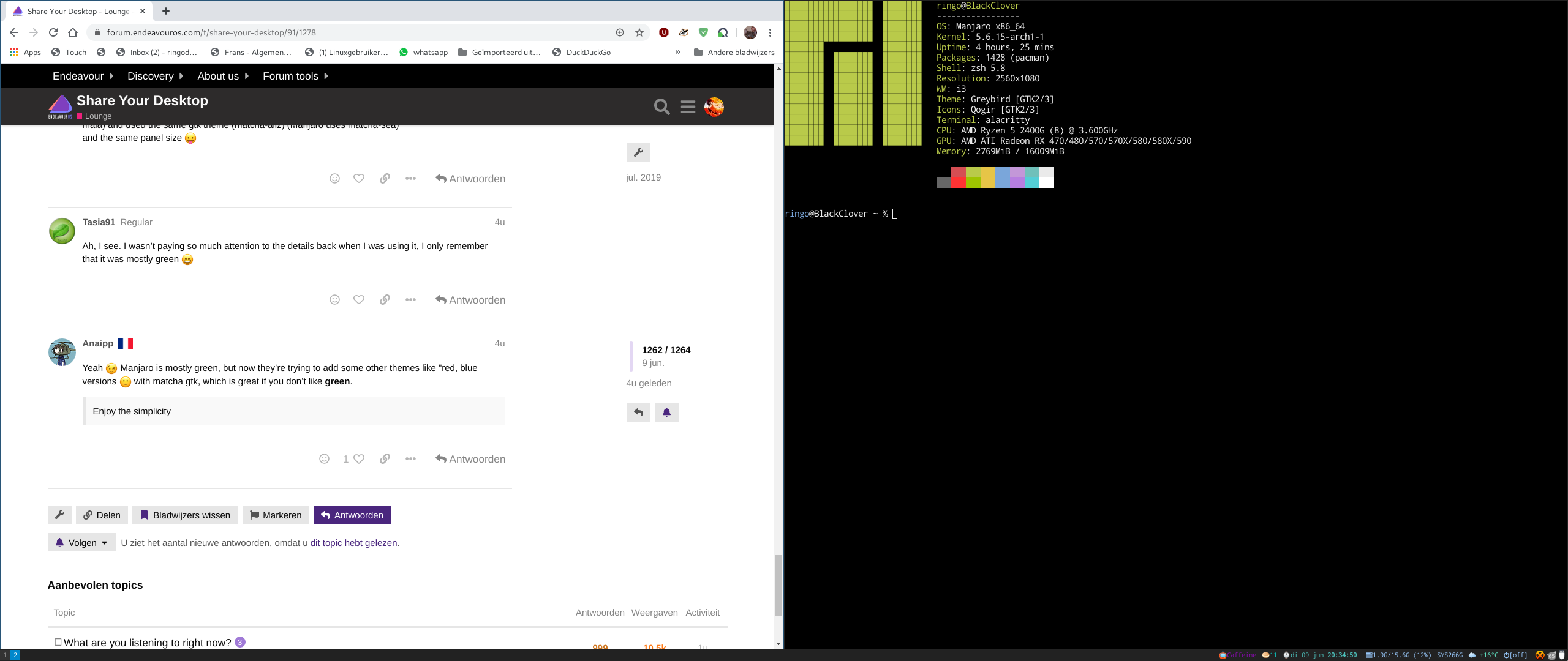
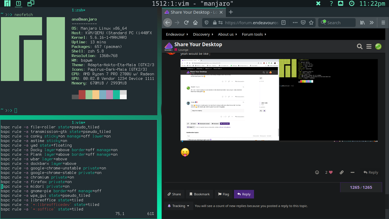
Why is it Manjaro clone? If I remember right Manjaro XFCE was themed differently ![]()
I choosed the same terminal settings, same icon theme (picked the papirus, because i don’t like papirus maia) and used the same gtk theme (matcha-aliz) (Manjaro uses matcha-sea)
and the same panel size ![]()
Ah, I see. I wasn’t paying so much attention to the details back when I was using it, I only remember that it was mostly green ![]()
Yeah ![]() Manjaro is mostly green, but now they’re trying to add some other themes like "red, blue versions
Manjaro is mostly green, but now they’re trying to add some other themes like "red, blue versions ![]() with matcha gtk, which is great if you don’t like green.
with matcha gtk, which is great if you don’t like green.
Enjoy the simplicity
yeah would be like ;

![]()
I like green and the Manjaro’s default bspwm theming is green enough even for me ![]()

Needs more green. ![]()
![]()

OT
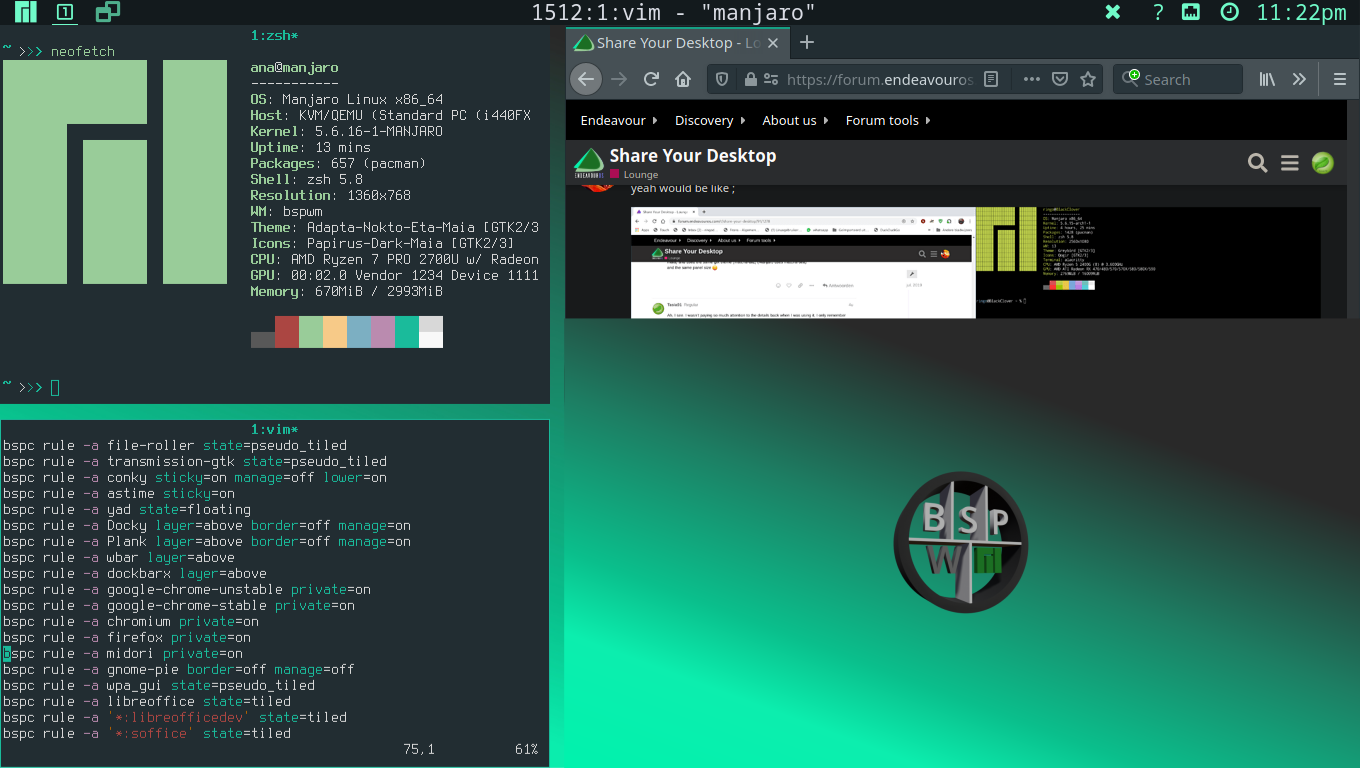
Looks like my BSPWM logo is in use ![]() , background-color, and style inspired by airclay.
, background-color, and style inspired by airclay.
I’m only making fun here. ![]()
Edit: Needs more green!
What do you like better about Xfce? I went from Xfce to Cinnamon myself. ![]()
I like both actually.
Ah i see you’re enjoying the simplicity ![]()

You know if you CTR+ right click plank you can configure it to remove the shadow. Then it would be fully transparent. I really like this wallpaper.

I thought that line a little above the icons was just some graphics issue with running EOS in a VM. I did ctrl+right click to get to the plank options like you said, but I’m not seeing anything that will get rid of that line. In the “appearance” tab the theme is already set to “transparent”. Even doing the other options there don’t make it go away, they just make something show up around the icons themselves. Am I looking in the wrong place or something? TIA
Without seeing it, can’t be sure… but going into the xfce settings, Window manager tweaks, Compositor, “Show shadows under dock windows” could be unchecked to eliminate the ‘line’ - if it’s what I think it is. If you’re not xfce, then something similar is sure to be somewhere in there ![]()
That was exactly it. Much appreciated ![]()
Overall to me, Xfce feels lighter and seemed like it had more customization options. Cinnamon had some options, but it felt a lot like windows to me and felt pretty static. A big part of this could be that Cinnamon was the first real DE that I tried, so I didn’t know what I could and couldn’t do, didn’t know about add-ons, etc. I certainly learned a lot from what I did with it. I might try going back to it and see how I feel now, but overall I’m happy with Xfce.
They’ve been polishing it a long time, and whatever good ideas someone had (other DE’s) they seem to have implemented it somewhere! I run a lot of distros, and most of them have XFCE on them now, because I miss features on others that XFCE has nailed… Cinnamon comes closest now to use, although the new Unity remix on Ubuntu 20.04 still needs to be checked out… ![]()
How did you like that Unity remix link i sent to you? Did you try it?
It loaded up find - haven’t done much with it yet. Still trying to find the ‘rest of it’ - for instance CCSM wasn’t included - and I haven’t been through the plugin list yet. Unity’s menu takeover (top bar rather than in window) is less workable with big screen resolutions - perhaps its time has passed (sob) - but will work with it more as time permits… maybe mouse acceleration will help?
I’m not sure if the link above is the same one I sent you before?