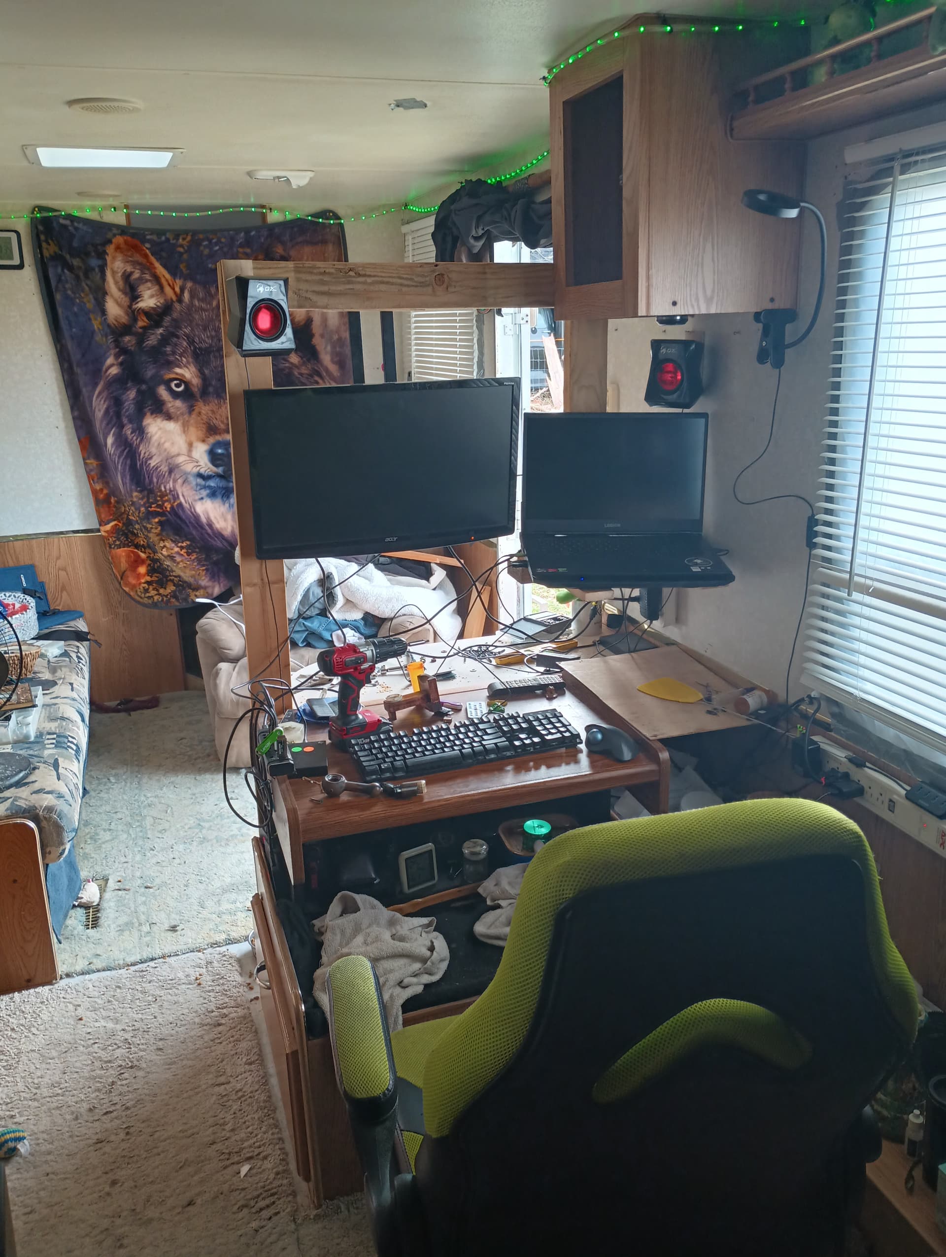
Took it to a physical level lol
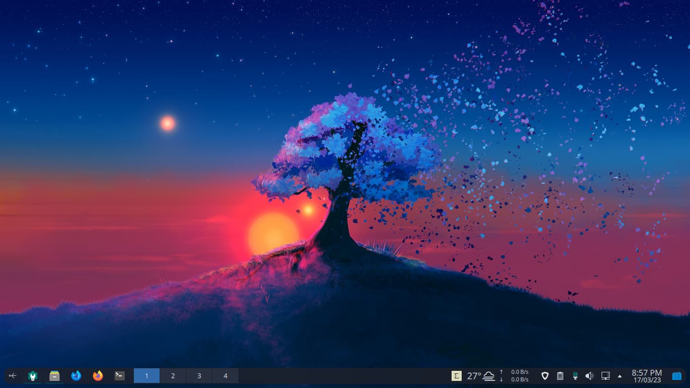
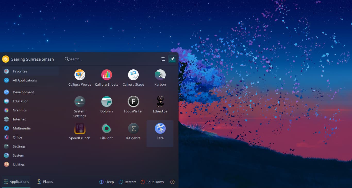
Before
After
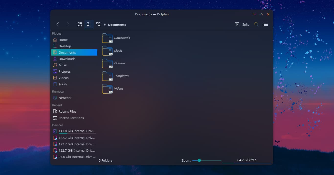
looks good! i have a few questions about this. is this the original kde weather plugin in your bar? what plasma color scheme are you using and why are the icons different in dolphin than the papirus icons in the bar?
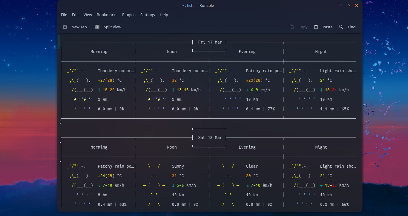
Its name is weather widget 2.
It is based on QuantumKvantum mechanics. It is infinity plasma theme.
Icon theme is also infinity-plasma, but they don’t have icon for Firefox-Developer Edition, because of which both firefox versions look same. Hence I had modified it a little to look good !
Thank you! That helps much. I was only curious ![]()
Very nice. I’m always happy to see a bright theme in others. Thought I’m the last who prefers the bright ![]() .
.
Just playing around with Plasma. Changing themes with konsave is simply super easy.
meanwhile i also like the lighter themes. i was always a fan of super dark. somehow the lighter themes have something though ![]()
I have , since dier dark fashion has become so fashionable, every now and then tried to come to terms with it, but I can never stand it for long. It is absolutely dull to constantly see this gray / black and it clearly makes it difficult to quickly grasp text. But like everything in life, this is also a matter of taste …
although . you also have to say that dark themes are easy on the eyes. to find or create a really good dark theme must just fit everything. from black to gray tones that just simplify the readability.
that may well be. i have set the upper panel to 23.
anyway, i can live with it. just wondered ![]()
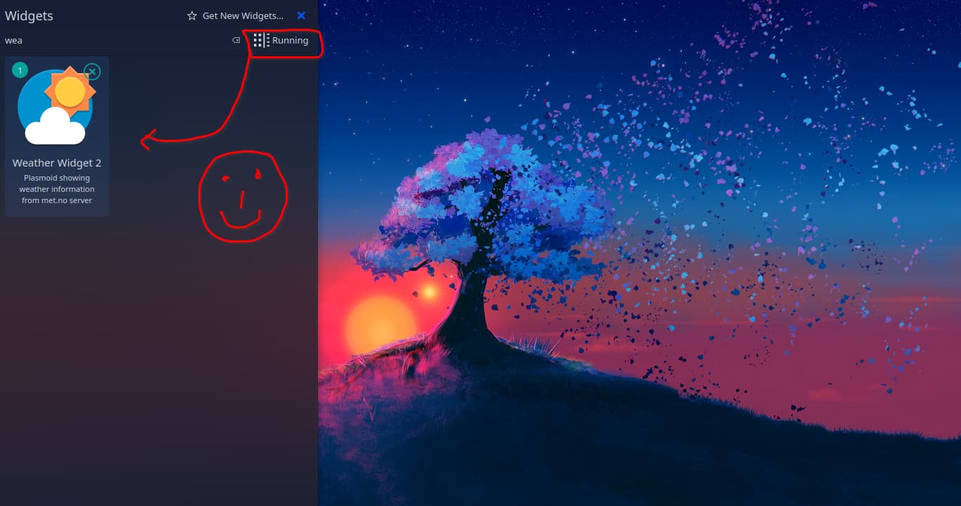
EDIT: it works. i drag’n’dropped the plasmoid into the bar. when i applied add plasmoid and clicked on the weather plugin, it placed itself in the bar like this. everything is fine
I agree. One of the things that bothered me in my attempts was the often very poor implementation. There is simply only software inverted, without any adjustment. I have already experienced that on pages the images were displayed negatively, black font on dark gray, no adjustment of color contrasts, etc… As long as this is not even all uniformly implemented and observed, the whole thing is just an imposition for me. I am a trained printer and typesetter and feel that such a destroyed overall image as bodily harm.
this context, of course, puts it in a different light.
i have a screenshot above of all black, then one with eospuccin as i call it for myself, it’s all half and nothing whole
but with the bright plasma i do quite well
I occasionally switch to Twilight, but the color matching of the icons to the background image in the application bar does not work. Let’s see what 6.0 brings.
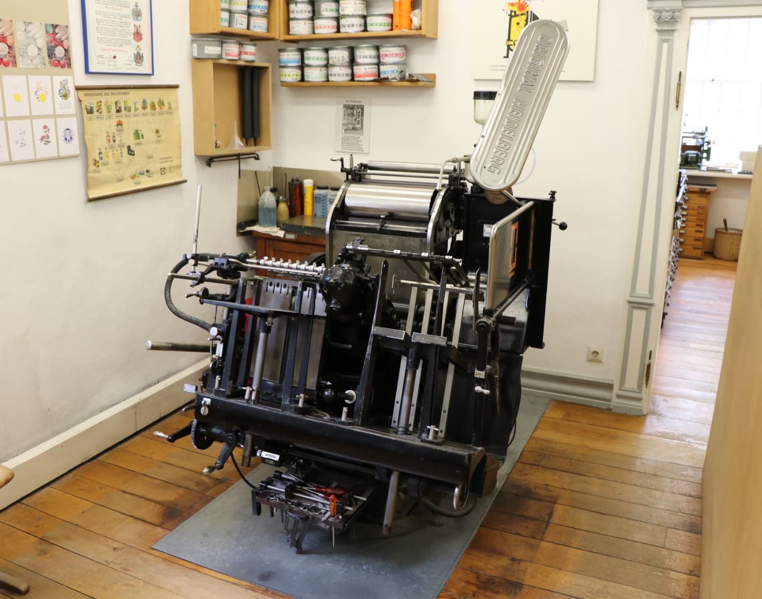
cool… i am also Offset printer ![]() back in 92 i was doing apprenticeship
back in 92 i was doing apprenticeship
In my case, it was 77. First letterpress (Buchdruck) then later offset. In letterpress, I still worked on the old Heidelberger Tiegel. It’s a pity about the old craft …
long ago …
that’s another one of those half dark, half light. that’s right, it’s not quite clean in the dark area.
i have now gotten into the habit of only using the pre-installed themes. i no longer install any that anyone provides. except for lightly.
btw, i am an electrician doing apprenticeship in 86. ![]()
so i am as old as @joekamprad and much much younger than @Balder ![]()
![]()
I’ve also moved over the years to using only the default stuff. Especially with KDE additional stuff can quickly lead to instability.
Well, I’m about to turn 63 … shit … ![]()