It’s always nice to see that I’m not the only one who doesn’t like darkmode.
1 Like
Why is it important not to be the only one? Isn’t it more important to be able to have the mode you are comfortable with, in your case Dark?
So, if every single Linux user preferred Light mode and you were the only one to prefer Dark, would you feel compelled to then also go for Light? Just a philosophical question.
I have to consider dark mode now that I learned there’s an extension you can turn it on and off in firefox. But it is useless if you work a lot with text, at least to me.
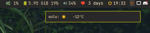
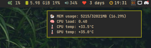
I just found out how useful notifications can be. With simple script I can print things like weather and thermals when needed without populating my bar with everything ![]()
Linux is so cool ![]()
9 Likes
You misunderstand me (or it’s the translator). I do NOT like the darkmode and already thought I was the only outcast … It seems to me rather as if the Darkmode is hyped with force and declared the new standard … Is ja überalll to observe. In my case it’s like this: I’m a trained printer and have seen the classic black on white for many years due to my job, have made layouts, read corrections, etc… Somehow it’s in there that I’m still more comfortable with that than this artificially inverted stuff (especially bad with inverted websites that were originally created in lightmode only). For me it’s just harder to grasp than black on white and it requires more concentration. But that’s all a matter of taste, and as I said, I’m glad that others seem to feel the same way, so that darkmode remains just an option in the future and doesn’t become the sole ruler. In the last few months I have tried every now and then to get used to the dark, but after two weeks at the latest I always switched back to lightmode and found it a great relief. Ok, the whole thing is only a IMHO … ![]() .
.
2 Likes
I’d rather not. When websites are forcibly inverted, something good doesn’t always come out of it. I’ve seen black text on a dark gray background or images inverted to negative. All this is not consistent …
1 Like
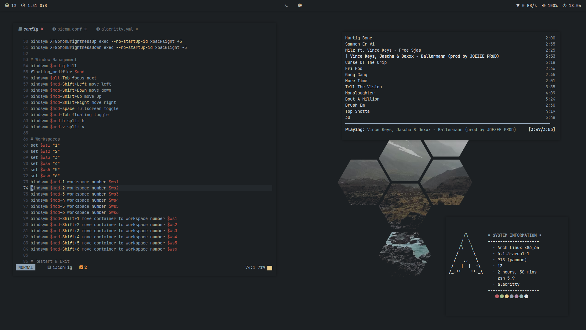
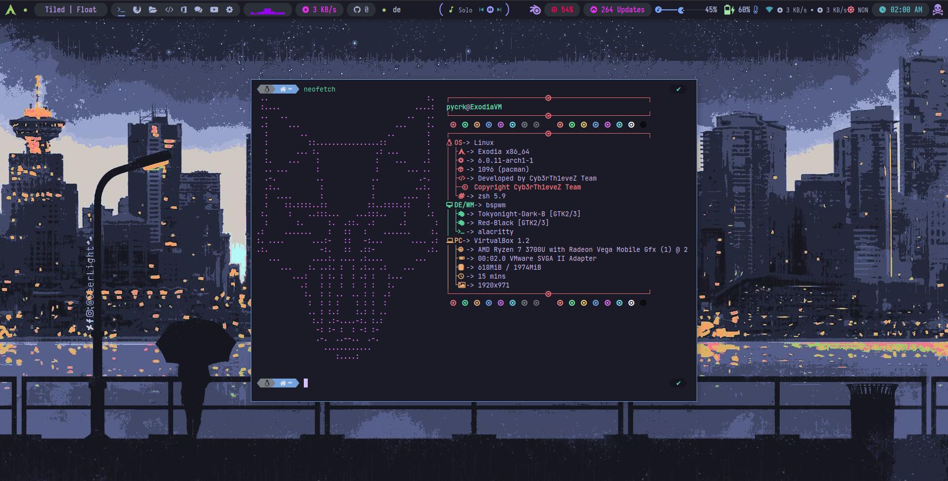
I didn’t read all 8k posts in this thread so this may be repeat of how others approach their desktop style, but here’s my current desktop:
Pretty clean, eh? ![]()
By using i3 without wallpaper (what’s the point?) each of my active window tiles is used for a different core (and often temporary) purpose.
Typically, window 1 = bash/neofetch; 2 = nnn; 3 = Firefox; 4 = Thunderbird; and then 5 & above are temps I invoke for a fleeting purpose (e.g, nvim on some config file, using LibreOffice, a jpg viewer, whatever…)
To my way of thinking, the whole point of using a tiling manager like i3 is to get as much real estate available and avoiding distractions as much as possible.
My “status” bar at the bottom of the screen (i3blocks) is the only constant throughout. There are a few clickable icons (sound, powerdown, bluetooth, Vorta,) but for the most part I access such services through the keyboard. Clicking would require reaching for the mouse - which I try to avoid.
Hope this is of some interest to someone reading this thread. ![]()
4 Likes
You could hide it away as well if you like to:
Example:
bar {
    mode hide
    hidden_state hide
    modifier Mod1
}
See: 5.3 > https://i3wm.org/docs/4.12/userguide.html
2 Likes
@pebcak Interesting! Thanks for pointing this out. Having just taken a look at your reference, I guess my remaining “thin blue line” provides me with the info as to which window tile I’m working on (rather than toggling on/off with mod key?)
Maybe I’ll give it a try and see how it works in practice.
Meanwhile, given how my desktop in its natural state is otherwise a big dark void, until I’m working on something, my single slim status line does assure me that we haven’t lost power in the house. ![]()
. . . . . . .
UPDATE : I just tried the mode hide / hidden_state hide / modifier Mod1 option as cited in Sect 5.3. Functions exactly as described. For me, I found the following behaviors less than ideal…
-
I had to hit a key to find out which window tile I was on, how many others were already in use, etc., instead of seeing that info at all times
-
I often use Cmd+F to ‘full screen’ an activity, which does in fact take away the i3 bar. It turns out this is one of the visual cues I rely upon to let me know whether I’m in full screen mode or not (which is especially useful to know if there might be other active open tiles on the same window #).
-
Not having the i3 bar typically seen makes it impossible to know from a glance as to whether I’m in full screen mode or not.
In short, it’s awesome to have this bar hiding option available - it just doesn’t seem to serve my use case and habits.
Regardless, its availability just further demonstrates how powerful i3 is as a window management framework. Fantastic!
1 Like
I’m middle aged, but still I get jealous when I see al those tiling window manager rices. Love to see what many of you’ve been doing here!
I wanna be one of the cool kids too! Tiling indow manager, neowim, polybar, emacs, suckless, and all that. I like my own Fluxbox than I’m generally at, but it is more traditional.
In any case, there’s no going back to a DE when you’ve come accustomed to the snappiness of a WM. Things happen the moment you think of it! and they are as configurable and sleek as KDE.
2 Likes
Beware of what you wish for!
You might find yourself out with all those anime avatars listening to symphonic metal with schoolgirl growling or some s**t… ![]()
2 Likes
Ha!
Anime avatar and pink socks are the first step!
1 Like
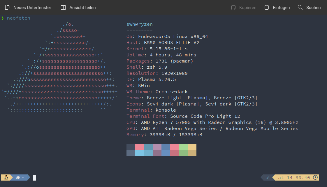
I have discovered new icons. Found them at a LinuxScoop tutorial they called Sevi Icons. really liked them. Now I have to figure out how to integrate Polybar into the Plasma desktop.
This is my New Earth Plasma Desktop with Orchis-Theme. Really cool ![]()

12 Likes
Hi guys testing a few things out.
In my config.ini there is now also a new custom font.
font-0 = “JetBrainsMono Nerd Font:style=Bold:pixelsize=11;3”
font-1 = “Font Awesome 5 Brands:size=11;2”
font-2 = “Font Awesome 5 Free Solid:size=9;2”
font-3 = “FiraCode Nerd Font Mono:antialias=false:style=Regular:size=11;3”
font-4 = “Font Awesome 5 Free Solid:size=11;2”
font-5 = “Noto Color Emoji:scale=8;2”
font-6 = “Material Design Icons:scale=8;2”
font-7 = “redblizard:size=11;3” <--------- This font is only used in combination with the launcher module.
4 Likes
Love that eos icon, it looks real good ![]()
Well there is not really an endeavouros icon for polybar, there is of course an arch icon or I should actually say a gylphs font because that’s what it is, but to use the one from arch with endeavouros that’s not really great so I thought then i have to be creative myself. And I think the result is quite good.
1 Like
New font = Jet Brains Mono?
Try Victor Mono.