The EndeavorOS website has a new layout… clean and beautiful.
Congratulations
12 Likes
It’s not finished yet, but thank you for the early review 
11 Likes
It’s looking very slick indeed! One (constructive) criticism: Top right EndeavourOS, The black Endeavour is a little bit obscure. Perhaps a white border around the black, or alternatively another colour for the font?
1 Like
This background is just an early draft, someone is creating a new design for us. 
3 Likes
Ooh, another one, typo under the Support section: “acces” should be access. Apologies for being picky. I used to be a proof reader in the printing industry a long time ago! I do understand it’s an early draught. 
1 Like
No, I don’t mind at all, like I said it’s far from finished and it’s getting time for bed because I can’t see my mistakes anymore. Tomorrow with fresh eyes.
2 Likes
Sleep well friend, I’m sure I speak for all when I say we look forward to the finished site. 
3 Likes
Just checked it out. Good job devs!
1 Like
It already looking great, especially integration with forum!
1 Like
Nicely done! Thanks for all the great work!
Just a little remark: the color of the text on the installation page makes it almost invisible, at least to my :eyes
https://endeavouros.com/docs/installation/
edit
Also when you click a link, the text on the upcoming page is pretty hard to read, again at least for my eyes:
https://endeavouros.com/docs/installation/preliminary-remarks/
1 Like
I think the K.I.S.S. principle should apply here. Simple White would suffice. Using colours is nice, but overuse risks looking “tacky”.
1 Like
Thank you for the feedback. In all honesty, I accidentally published the new website and since the very first moment, there were already reactions to it. So, I decided to leave it instead of getting it offline, fits our open communication towards you, and see the current version as a work in progress. I hope to surprise you with a more definitive look in a couple of hours.
2 Likes
3 Likes
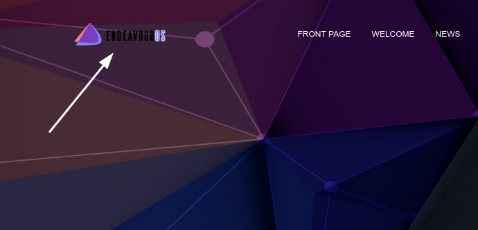
@Bryanpwo The new layout looks very good. A tiny suggestion: you probably need to change the color of the text here. (or do something else to make the distro name more readable)
2 Likes
Have to agree that the font is illegible against the background. I had to select all the text to highlight it before I could read anything. KISS always the best practice.
To those who are interested, just visit it now.
2 Likes
The text is still overlaying the image text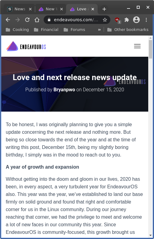
1 Like
Looks much nicer, easier to read with no background distraction. Thank you!
1 Like
Much better to my poor eyes. Like when you get new specs from the optician and the world suddenly becomes HD.
3 Likes
This header image is a place holder, I’m far from finished.
1 Like