Like life it’s an evolution, keep on keepin’ on! Some Distro websites look a bit too serious and boring in my opinion, whereas others look to much like comedy or “bling”. I think if you can make it dynamic, welcoming and interesting then that is a good result, whilst maintaining the fact that terminal is a good way to learn. Come on newbies and doubters about Linux, don’t be afraid of the Command Line. As they said in Dune: Fear is the mind killer! Open your minds 
It certainly does look very nice.
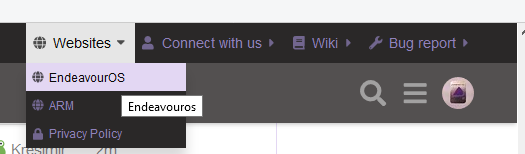
I would like to make one suggestion: to find the Forum, you have to go into Community first. I suggest that a separate Forum tab be introduced to make it easier for someone investigating EndeavourOS to quickly find the Forum.
It’s just my thought …
Lawrence
Yeah i agree, personally i’d do something like:
- Move Bug report to Download & help dropdown
- Make Forum just single button

As an addition to the previous answer, the support icon in that same row, redirects directly to the wiki.
I deliberately didn’t make the orange icon clickable, logically it could direct to the download page, but to encourage the visitor to read the info on EndeavourOS first, I disabled that function on that icon.

Today purple text across the top, hard to read. I guess css overlap error. ![]()
Is it hard to read on your screen?
Sitting outside with a laptop I struggled, inside not so bad, I am guessing this is the new way.
There was a brief period where the purple text was much darker. Is it still hard to read with the current purple?
I also changed the background colour a bit more, how is it now?
EDIT: I’m also testing outside on a laptop but every laptop screen differs, so I would appreciate your input.
Yes it’s better, sorry.
Looks good here on my screen. 
32" monitor on my desktop.
It’s a bit wasteful on the screen real estate. So I propose, instead of this:

something like this:
![]()
Only nicer, with matching colours and proper alignment… And responsive, so if there isn’t enough room, just move it above.
Sounds like a good idea - but wouldn’t fit on my screen - overlap of nearly 25%! I could probably play with it to make it work out, but I’m happy not having to…
i point this out to @Bryanpwo … he kind and explain it done for mobile ( think i right )
The menu bar has been on the forum since September 2019, the only thing that has been changed are the place, it used to be above the logo, the colour of the fonts, it used to be white and the size of the fonts, the size is smaller.
There are also icons in front of the menu names for adding some spacing between the different categories.
Screenshot of the forum from July 2020

Looks good. But is not the same size of it which does not look as good in my opinion.
The size of the bar didn’t change, it’s a fixed size.