After the recent EndeavourOS Mirror list thread popped up, I ran the usual updates with yay and got similar errors as others in that thread. I won’t focus on that topic here, but rather what I discovered today in addition to that thread. At the beginning of this week, the package I enjoy to use for handling .pacnew/save files meld got an update in the Arch repos going fromv3.20.4-2 -> 3.21.2-1. The 3.21.x series has been out for awhile according to the meld GitLab releases and with this release there has been a new UI overhaul that changes the layout of the application.
I don’t come across .pacnew/save files on the daily, so I didn’t discover this until after today’s endeavouros-mirrorlist update. The meld UI update is a bit jarring and has confused quite a few users, including myself, going from a typical GTK2/3 contextual toolbar layout, to a more icon/button focused layout eliminating the context toolbar entirely. There is a bit of a discussion about this over on the Gnome meld Discourse.
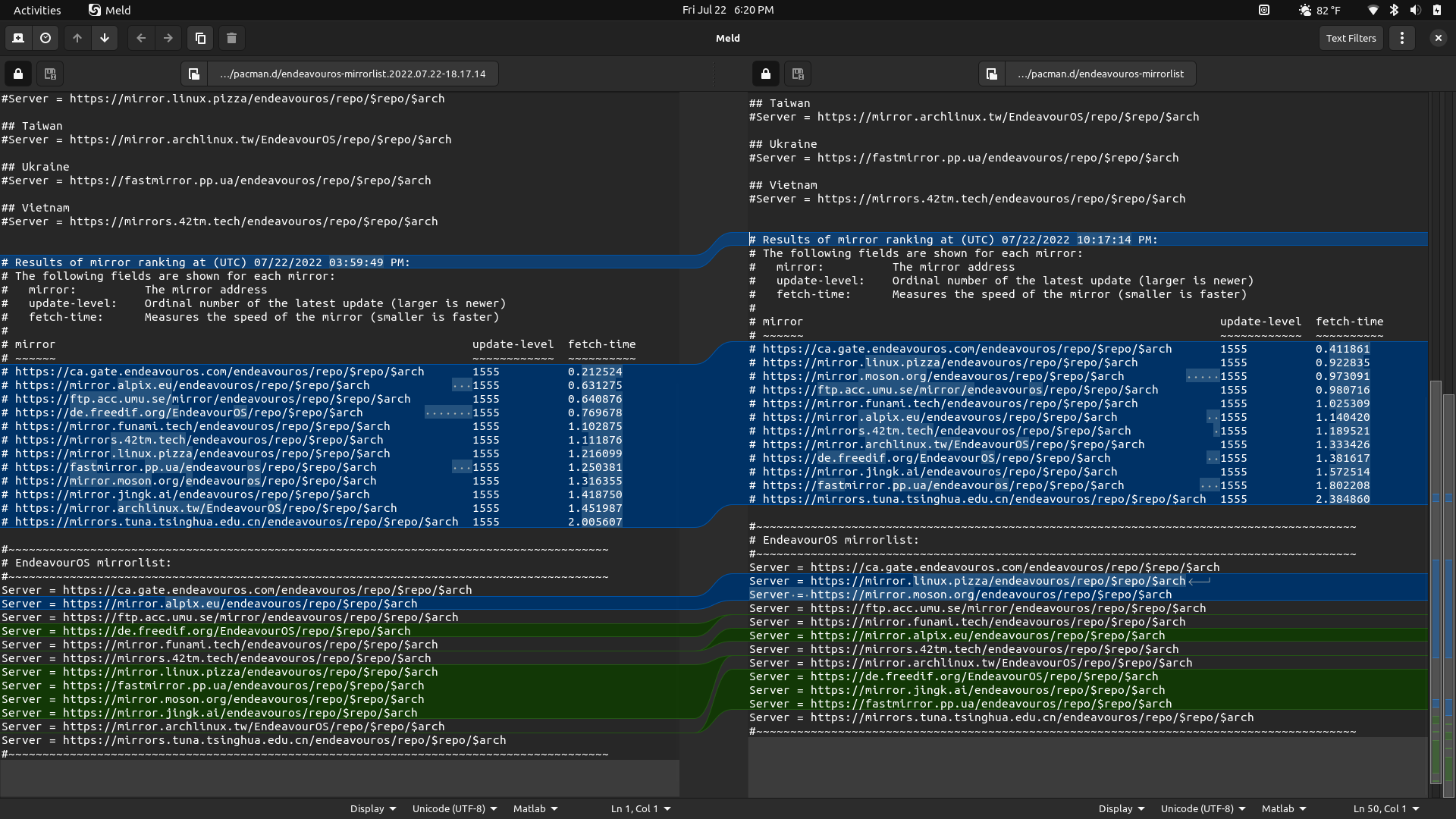
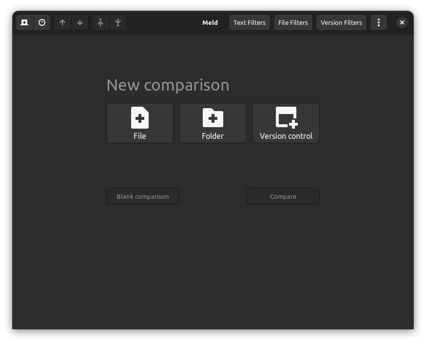
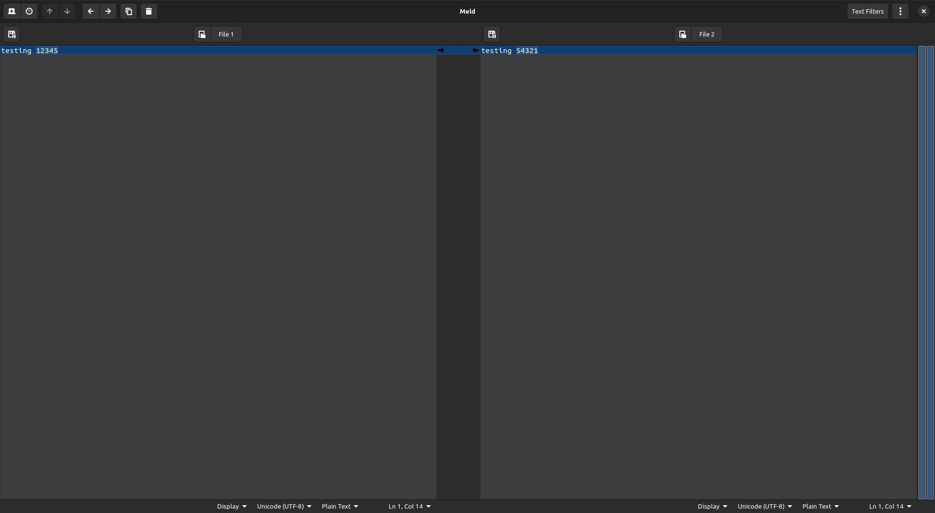
For reference, here’s the NEW meld layout:
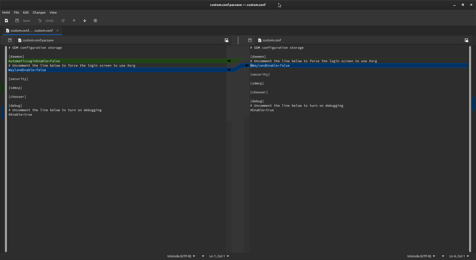
And here’s the OLD meld layout for comparison:
I just wanted to give a heads up; the new UI is a bit jarring to use at first, but it’s good to see an application get updated to a more modern state in-line with other GTK designs. I don’t use meld a whole lot so it might take a little getting used to, but if anyone comes across any issues or bugs with this update or thinks of any suggestions that might make this new UI transition better, please do feel free to file an issue on the devs GitLab, they are pretty active: Meld GitLab Issues
Ah well actually the arrows where there the first time I ran eos-pacdiff and launched the new meld but I didn’t make a screenshot for it then. This screenshot of the new UI is just me re-opening up older mirrorlists to compare so I have something to show what it looks like otherwise meld just opens to this and it’s not quite as good a comparison:
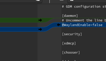
These arrows were removed between your two screenshots:
Honestly, with the feature-free direction that many gnome applications seem to heading towards I guess we are lucky that we can still compare two files.