I’d still say Windows is better looking and more usable than Gnome though. Heck, I’d use the aforementioned DWM before Gnome, it’s far more usable.
No, dwm is truly excellent, no joke. I so want to switch to it permanently (instead of switching to it every two weeks), but I need my wobbly windows and magic lamp…
Not familiar with magic lamp, but I do like wobbly windows.
As @TurkeyJohn would say:
Wobble-Wobble! ![]()
@keybreak, well put! I wholeheartedly concur. ![]()
Prepare to have your entire world shattered and rebuilt:
OK, I remember a similar thing (maybe same) back with KDE 3 + compiz.
Also Gnome 2 and Kompiz.
Yeah, it’s nothing new. Which makes other DEs look even worse in comparison 
And with all that bloa shiny features, it is still one of the lightest DEs when it comes to RAM and CPU usage…
But this is a thread about GNOME, and none of this applies to it, so let’s get back on topic. 
Gobble Gobble*
I was a little surprised when I saw a few bits of Gnome 40 already trickle onto my desktop ahead of Wednesday’s release. I was expecting it to take a while in testing before reaching the main repositories.
Side note:
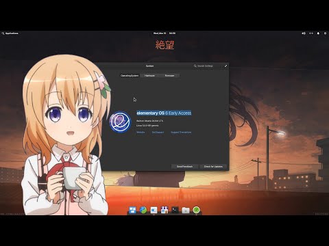
As interesting as their videos are I find they usually err on the opposite side of things.
Like outright and unironically stating that Cinnamon is pointless, or nitpicking Plasma / Elementary “faults” while refusing to aknowledge Gnome’s (And, ironically, always use Dash-to-panel, which kind of indicates they do not like Gnome’s ACTUAL default workflow…).
I just find it amusing. 
I must say that I really don’t understand why the app-picker even exists in Gnome 3.
Not being grouchy here but SUPER+SEARCH and maybe a favorites bar is all that is needed. Seriously.
Unless you are building a touchscreen UI of course… Which they keep denying that they are optimizing it for while constantly optimizing it for it. Same with Gestures.
I think it’s one of the problems, perhaps, that Gnome 3 is trying to be 100% Keyboard-centric, almost equal to a tiling WM, while ALSO being optimized for the complete opposite: Touch screens.
It would explain why the app-pick window feels so disjointed; on desktop it doesn’t belong at all, especially not with features like folders and drag and drop and re-arrange icons.
While on a touch screen it’s the opposite; the app-picker is absolutely mandatory and the search bar is unnecessary; typing search words on a tablet keyboard instead of swiping back and forth or up and down is much much worse.
I hate touch screens. On a tablet okay but a laptop or a desktop no. Unless it’s a 2 in one where it can be used as a tablet i can see that. Otherwise no! Not for me.
Is that an Amazon Polly voice? They’re getting harder to tell…
Don’t touch my tablet! 
Yes it is Amazon Polly. Baby Wogue (the person doing all those videos) uses it all time
I like the actual content enough to put up with all the anime things. 

