I never use categories, I find it cluttered and confusing.
1 Like
I think the new layout does indeed make it a bit easier for new users to navigate to the right place to post issues. With that said, I vastly preferred the old layout. Setting default home to new makes it bearable, though.
now i understand you ![]() you are talking about the Blocks and the Rows view for Categories
you are talking about the Blocks and the Rows view for Categories ![]()
Both of them are not the 100% perfect solution, as where Blocks view has no descriptions of the Categories and only shows the Top 3 posts:
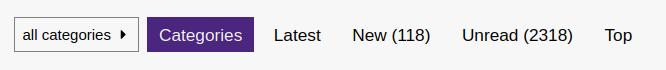
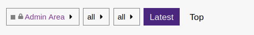
on Row view you have a description but top panel only shows Latest and Top as Buttons…
Are you sure you want “New” and not “Latest”? Discourse’s decisions about what constitutes “New” has always been a little strange to me.
3 Likes
No you are correct, I quickly realized I wanted latest and did indeed switch.
1 Like
Yeah, I really miss this view. Would be nice to have it back as an option. The defaults that you can select in the user preferences do not reflect what I need from a starting page.
1 Like
My only problem with the new layout is that the default does not indicate which posts/subjects have already been read (and thus is not useful). The previous layout appears to have been showing ‘latest’, so that’s where I have gone…
1 Like
Me too ![]()
Is there a way to change it back for me self?
I like the “old” two panel view. Now there is like in Windows 8 only Panels, and they dissappear if you click on new, actual, etc.
1 Like
As mentioned before Latest is the closest to old way, but without categories / subcategories.
P.S. My I hate it and Why i hate it posts was quickest posts i ever made to get Nice Reply badge 
2 Likes
The previous homepage is back, although when clicking on the main categories, the sub-categories will appear in the boxes style.
16 Likes
Thank you. I wasn’t going to complain (British stiff upper lip  ) but it looked dreadful…
3 Likes
@Bryanpwo
I like it better this way also. We Canadians don’t complain too much. 
3 Likes
I think it was worth trying - but I am glad the experiment has been terminated. It SHOULD have been an improvement, but the lack of indication as to whether a topic had been read or not was debilitating - so we had to default to alternate page views for practical reasons.
I won’t even mention how tough it is to get people to change (!), regardless of whether it is an improvement! Which is why I (for one) tried to just work around it without whinging (or just a little!) - but in this case until they update the functionality, the reversion is appreciated!
6 Likes
I don’t mind it either way, just would have taken a little to get used too
1 Like
@ricklinux Fixed it for you ![]()
Edit: Love the new “new” layout btw, thanks @Bryanpwo ![]()
1 Like
The main reason for that change was to help new users find their way to the right sub-categories, that’s why I left them in the boxes layout. Even experienced users use the main categories for everything, and the second reason, which actually worked, was to get new users better attention to the pinned messages.
I still have to figure out a way to get more attention to them.
5 Likes
@Bryanpwo nice change ![]()
Would it be possible to change color of text depending on theme. for example black colored text in white theme. If not then only black would suffice as the purple background is light
Also there should be a option to turn it off.
1 Like
Is the white text really that off-putting?
1 Like
It makes it stand out more, which is a good thing - maybe new members will actually read it.
7 Likes