Since last fall, Discourse has added a new forum layout to the software package. I’ve been using it on their forum and it looks and feels more organized to me. Now I’m wondering what your thought is on it.
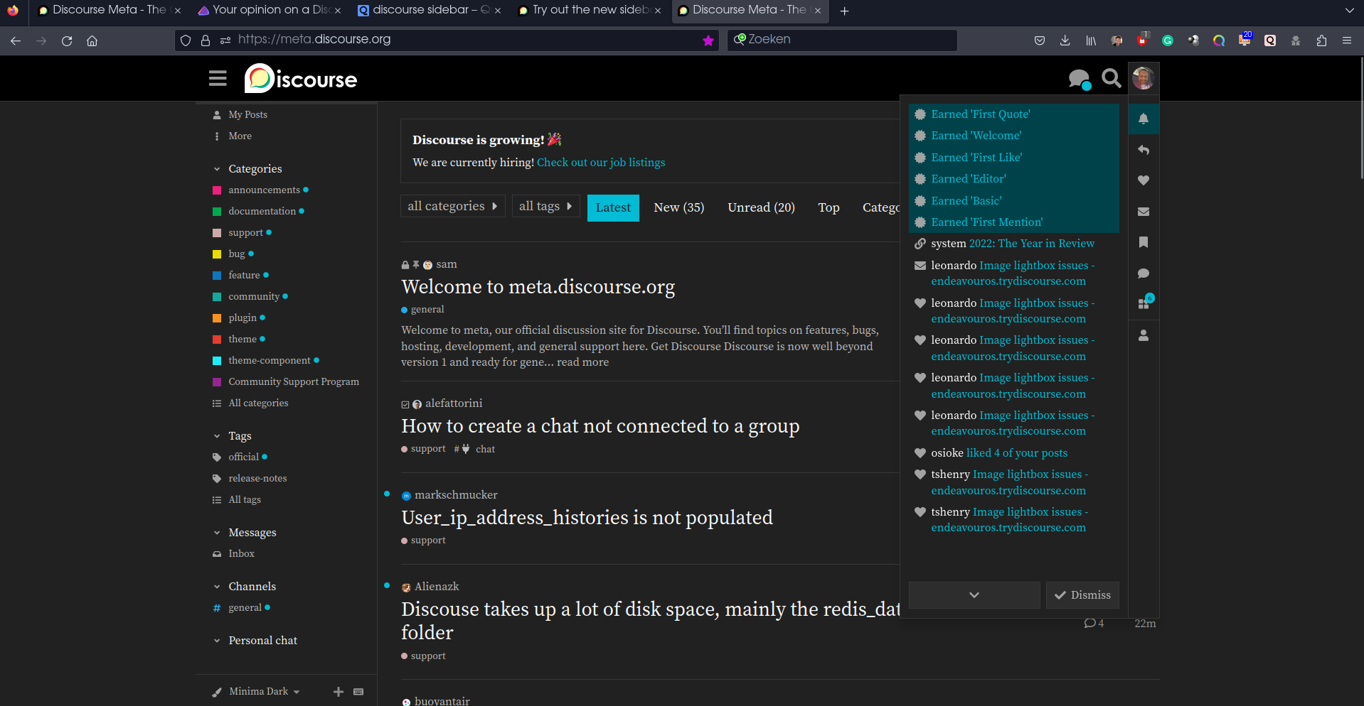
It looks like this:
It actually are the categories and your personal settings rearranged in a sidebar. Those items are also there in the current setting, only some of those are too hidden for a lot of users
The wiki directly on Discourse is great. Maybe we can replicate ?
Edit:
I see lots of benefice for doing this: dark theme support, users could draft directly wiki page on the forum (maybe a new categories for this) and when its ready be pushed in the wiki categories by a member of the staff.
IMHO it is an improvement for the current layout.
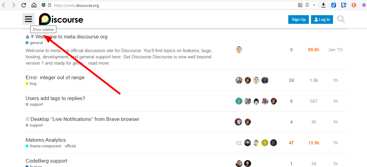
You don’t lose anything currently in our old layout.
The main section with the posts view remains exactly the same, while the left panel has the filters constantly open, with no need for an extra click to open the menu.
It actually takes advantage of the current empty space (left and right), which always bothered me.
I am sure the extra noise is a matter of time to get used to, and it will soon not bother ( dalto. For me, it’s already not bothering ).
Smaller devices view is exactly the same ( or better?).
Wiki sites (including Arch wiki) are doing this now, and I really dislike it. Wastes a ton of screen space and it’s just clutter.
Also, I am myopic, so I like to set zoom in my browser between 200% and 250%, so I have nice, big text. The side bar, unless it is made in a smart way to hide when there isn’t enough room for them (which more often than not, are not, or the threshold is set way too high), then just compress the text, so I have short lines. It’s a mess.
Wikipedia has become like this too, which takes extra work to make it look enough like the “old” version. I don’t know, I get disturbed when I’m scrolling down an article and the left-hand side of the screen updates according to chapter. The search box they have now isn’t an evolution.
EDIT: it could be a lot worse than this “new” layout that’s possible… the other forum for another Arch-based distro that is a hole I might have fallen into instead of this one.
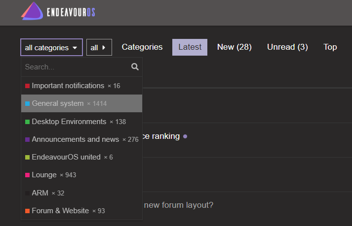
The present Forum looks are nice and all the categories appear bigger.
The advantage which I felt with the present appearance is that the topics with recent activity appears directly on right part of screen, because of which one can easily access the recent topics.
And in the screenshot you shared, that is not visible on the first look. Rather, it only displays the categories with recent activites.
The present appearance is/was the trademark look for Discourse forum, which made it look apart from other services. The newer look makes it to stand in the crowd.
How about quoting the entire paragraph instead of what you chose? I was talking about Wikipedia. I did click on the link @Bryanpwo provided on this thread and saw things similar to Manjaro forums and, remotely, to Solus forums (which I used to lurk into but don’t post anymore and right now it isn’t even possible). It could be more distracting (for me) than actually to have an “opening” screen like one of those other places, after cookies are cleared etc. from web browser.