Some Background
Back when I used GNOME and Cinnamon, most icon sets were in .png format. I found a monochrome set I liked, but it didn’t cover all the icons I needed. I either had to ask the creator for more (if they were still active) or make them myself in GIMP.
I’ve always been a fan of monochrome icons, so finding the right set was usually my first step. But editing gradients was tricky, and creating multiple sizes for each icon was time-consuming. Converting .svg files to .png for editing rarely worked well.
After switching to KDE Plasma, I noticed most icon sets were in .svg format. At first, I felt stuck—SVGs were new territory, and I didn’t know how to edit them properly.
Inkscape: The Journey Begins
As many have said: use the right tool for the right job.
My Goal
Create a monochrome icon—one that uses only a single color.
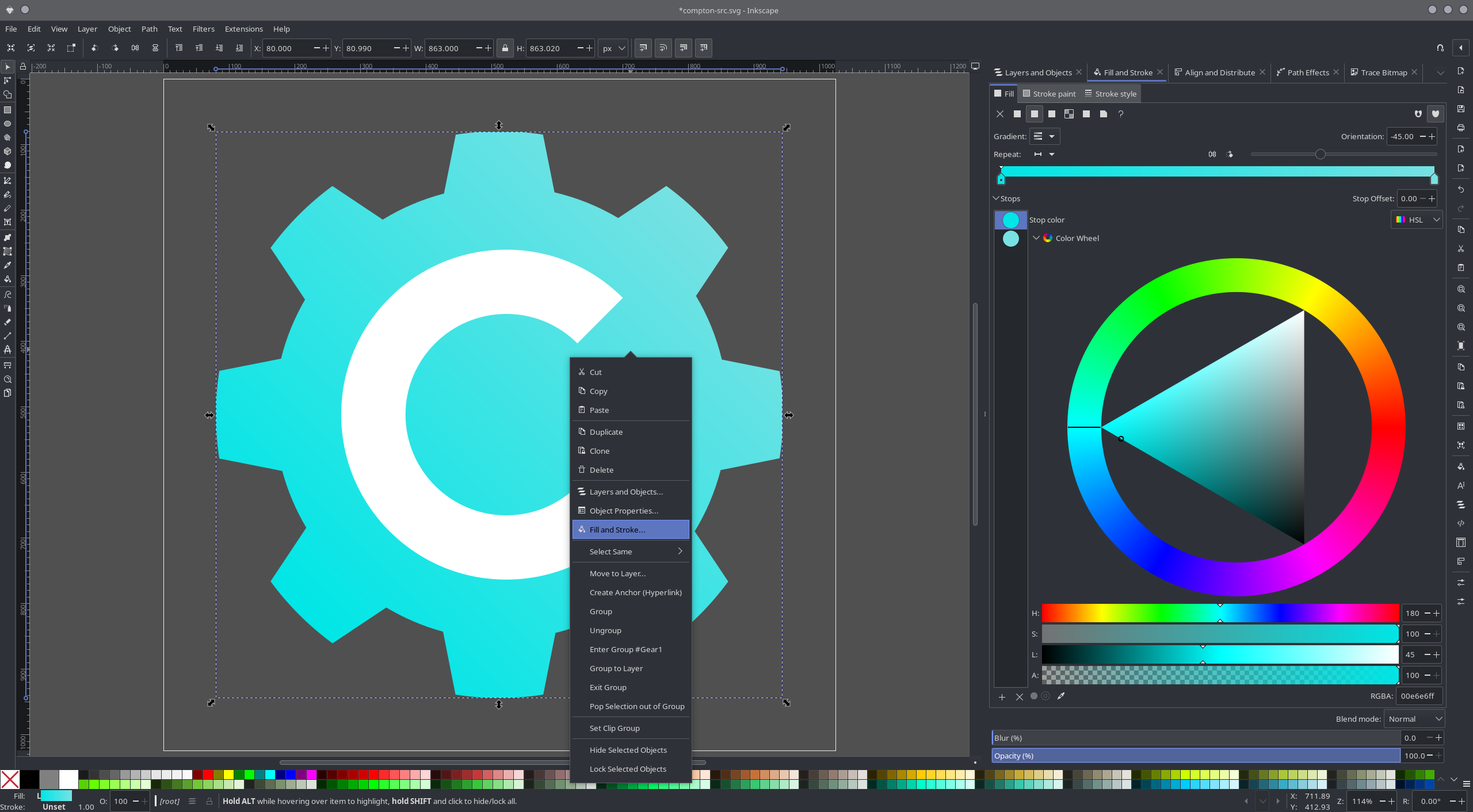
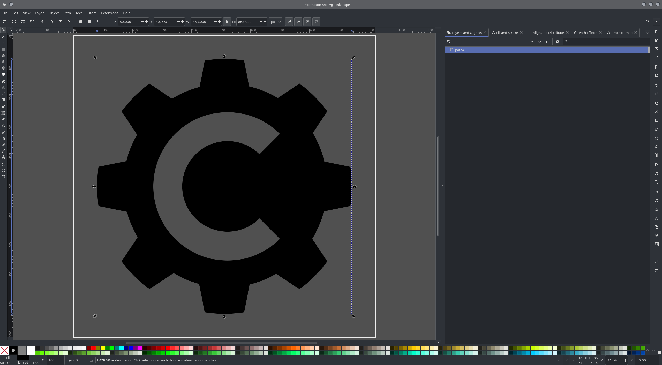
To demonstrate my basic understanding, I’ll use a Compton icon I downloaded from the internet as an example.
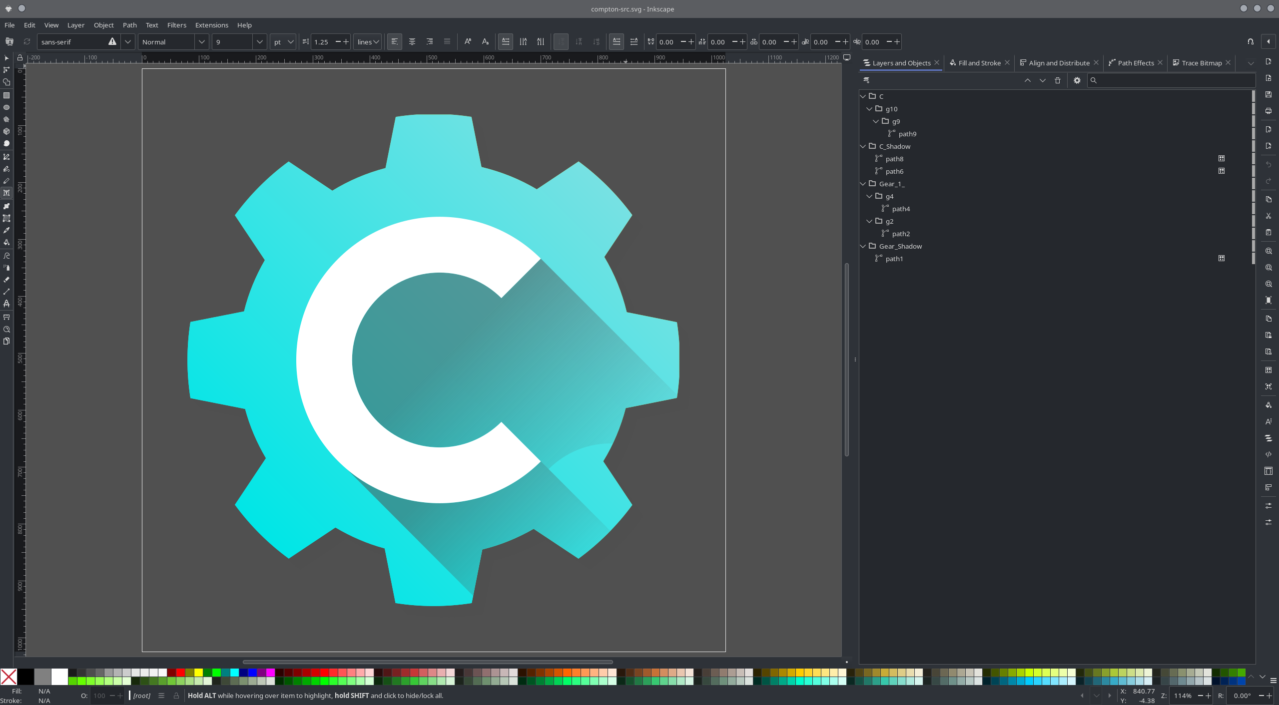
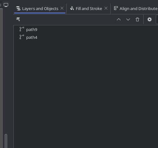
On the left is the document area displaying the icon; on the right is the Layers and Objects panel.
Believe it or not, even tiny system icons can contain more layers and objects than you’d expect!
Multiple objects can be grouped together for easier manipulation—like resizing or repositioning.
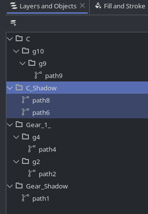
In some cases, I’ve come across nested groups (e.g.,
path9 in the screenshot). I still don’t fully understand the logic behind them, but it’s something I’ve learned to look out for.
To simplify the icon, I started by removing the shadow.
This was easy: I just deleted the C_Shadow group or the individual path objects inside it.
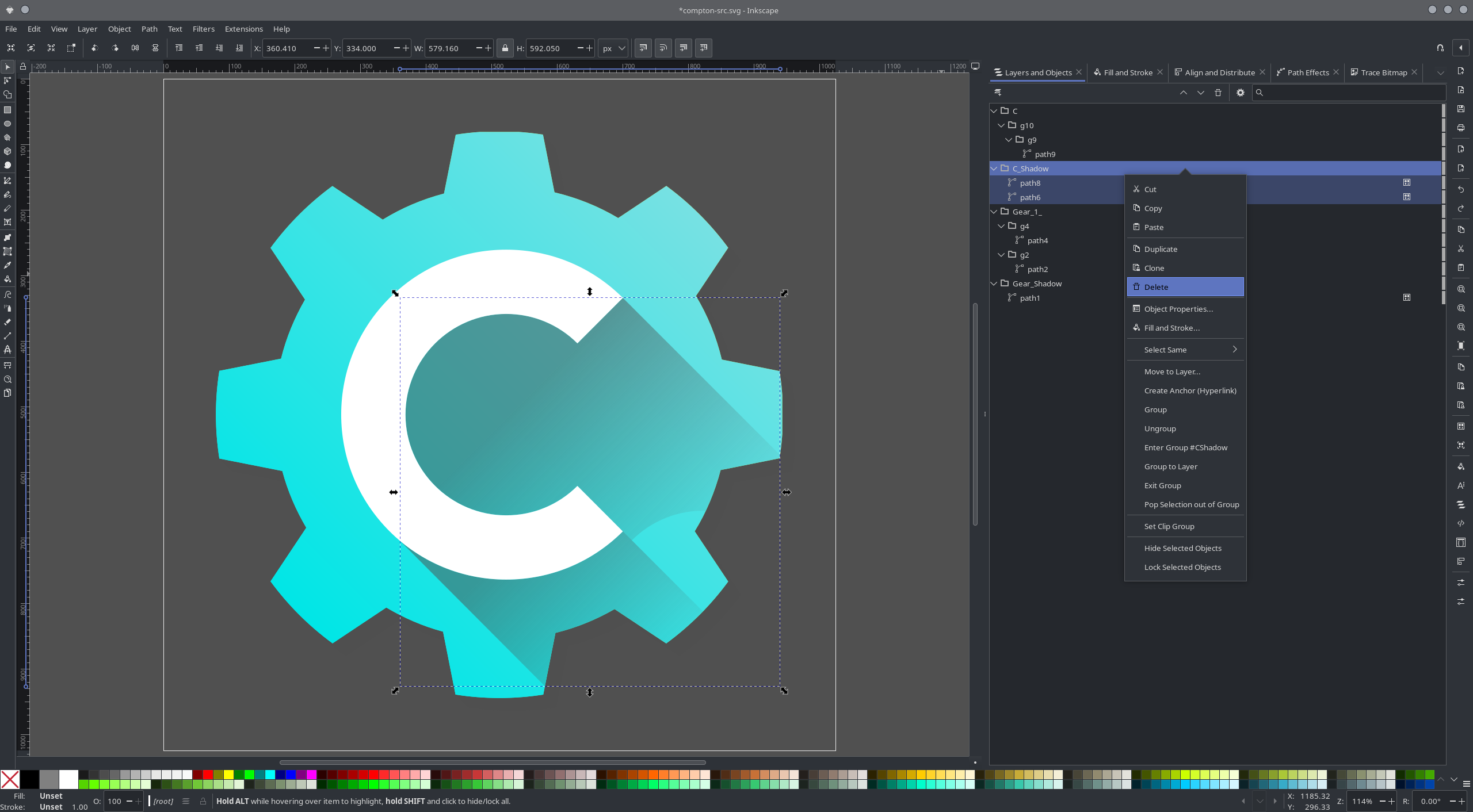
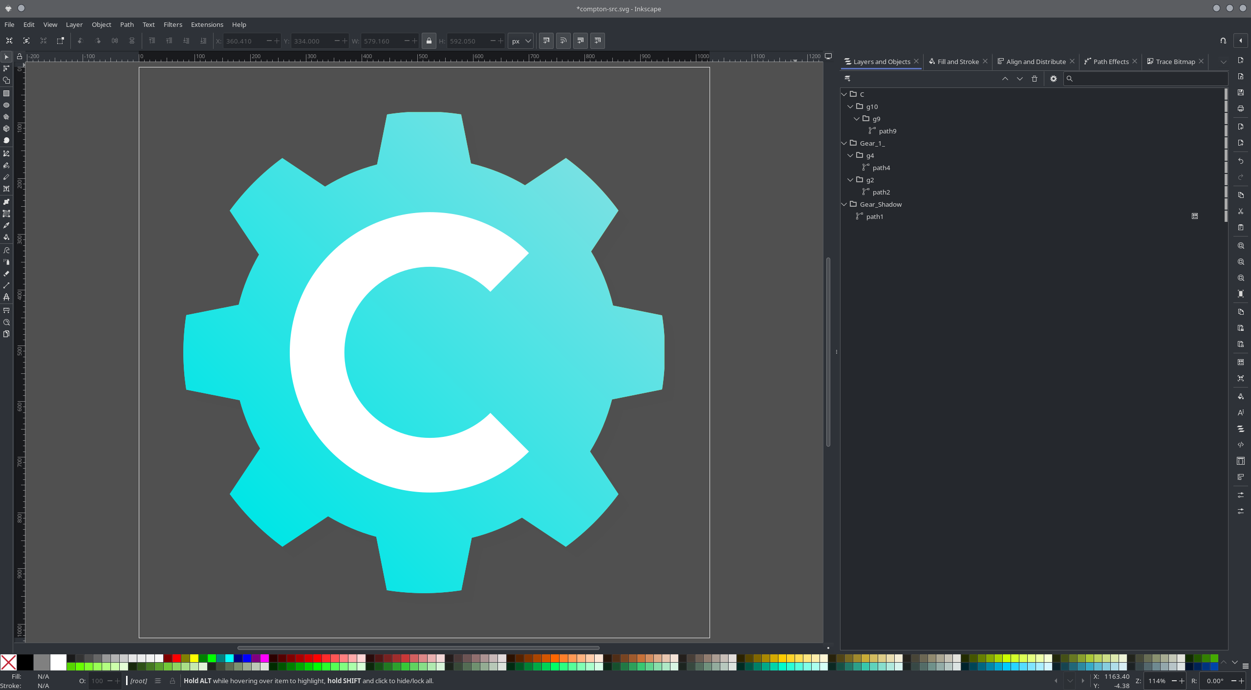
Next, I only wanted to keep the gear and the ‘C’ symbol. While both were visible, there were two extra objects I didn’t need:
Gear_Shadow — not visible due to low opacity and the background color
A gradient version of the gear, hidden beneath the main one


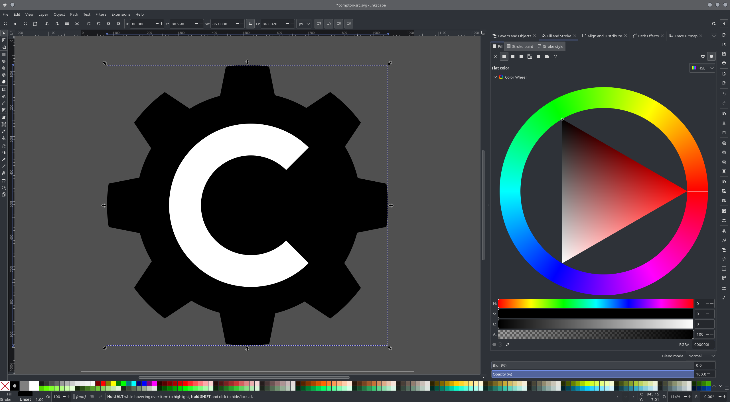
I wanted to set the gear color to solid black.
At first, I was confused and tried using the color toolbar at the bottom of the window.
Eventually, I found a much better way: using the Fill and Stroke tool.
To access it:
- Select the gear object (
path4) - Right-click and choose Fill and Stroke
This opens the Fill and Stroke tab in the right panel.
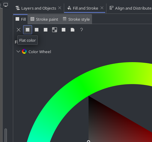
The gear was originally set to a linear gradient. I changed it to a flat (solid) fill.
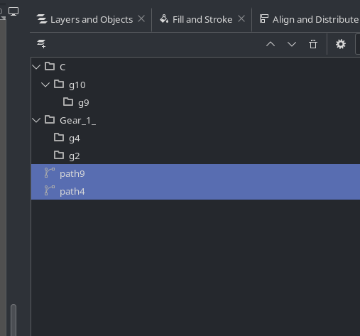
After cleaning up the unnecessary objects, I no longer needed the groups.
So I simply dragged the objects I wanted out of their groups and deleted the empty ones.
Final Step: Cutout
To make the icon truly monochrome, I needed to cut out the ‘C’ from the gear shape.
Here’s what I did:
- Selected both the gear and the ‘C’
- Went to the Path menu
- Chose Difference

And here’s the result:
Final Thoughts
This post only scratches the surface of what Inkscape can do. There’s so much more to explore in this powerful tool.
This isn’t meant to be a full tutorial—just a personal log of my learning process.
It took me weeks to understand even the basics. If you have any tips or tricks, I’d love to hear them!