The online install takes longer than usual, due to the measurements of the Corona pandemic, internet usage is higher and also our April release gets a lot of attention, traffic was high, especially yesterday.
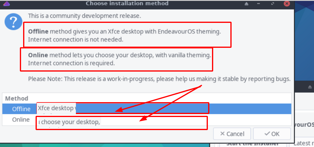
@manuel you remember when I proposed the idea of 2 differents colors theme to make a difference between Offline and Online ? it was for KISS understanding… As you see they don’t read the window, even if it’s written on it !!!
Maybe add simply text on buttons, you have space for it as :
OFFLINE Xfce EndeavoursOS
ONLINE Vanilla DE
Now, I don’t know if you consider i3 as vanilla or not ?
And, of course, an item on the Welcome App - to install the EndeavourOS theming if you happened to online install (to avoid future massive updates). Just a thought - the theming already done saved a lot of time on my setting up! (just installed GTK theme, Window manager theme and Icons - all the panel setup is great though (including whisker) and it leaves me only thunar capabilities to add and plank to install!
I think adding even more text does not help if someone does not read the currently available text.
Adding 2 different colors (online, offline) may also confuse people, if the purpose and meaning of the colors is not clearly specified. I’m not really opposed to having different base colors, provided it is clear for users why they are there.
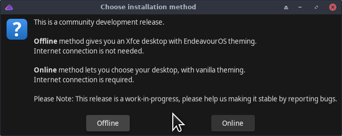
What about if the choice of Offline or Online install was made earlier - separate choices in the App that starts things off? It seems to me that the explanation can be given more clearly there (by language as appropriate) than in the selection box. I suspect that calling Calamares with the option already set should be easy enough. BTW - I never had any doubt about what you guys were doing, and how to get what I wanted - but it appears that reading comprehension is not universal!
Besides language, people tend to not read what they are doing when instaling a distro. I often receive emails from English speaking people who can’t find the online option, just because they clicked too fast. When I redirect them to the Main website page, they often apolagise for the email.
In reference to the French complaint, I don’t mind that the option gets extra info, but let’s not jump to conclusions, because one or three persons click faster than they can read.
So if they don’t find it, you confirm that we don’t present it enough well…
That’s why I proposed colors theme to bring the difference on Kiss way between Offline and Online.