let me know what you guys think? IDK i kinda suck at making wallpapers… you guys are so much better than me haha
UPDATE i centered it and almost all of these so far. they look so much better that way IMO. i intend to finish all of these.
here it is centered:
11 Likes
one more that is different i guess:
if anyone wants to try and improve on my design it’s cool too
i like the red in this photo <3 idkw i just do
centered:
5 Likes
Not bad, but I think it would be better if green.
Maybe make it green…
Yeah, it’s very nice, the only little detail about I don’t quite like is the fact it’s not green. 
4 Likes
I like this one, but it looks compressed with that effect on the edges of the neon. Nice work overall though 
1 Like
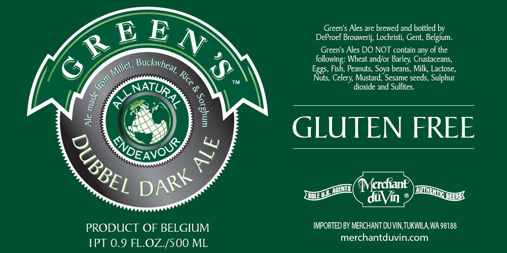
Belgian Dubbel Ale… and green. Is this heaven?
Wait a second… how do they brew beer without barley or wheat? Something’s fishy here… Millet, rice, buckwheet and sorghum. Doesn’t sound like beer to me… 
1 Like
man those colours really work well together 
1 Like
