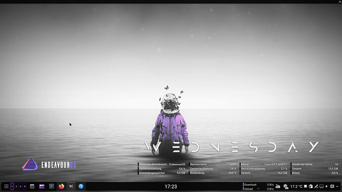
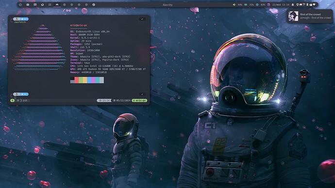
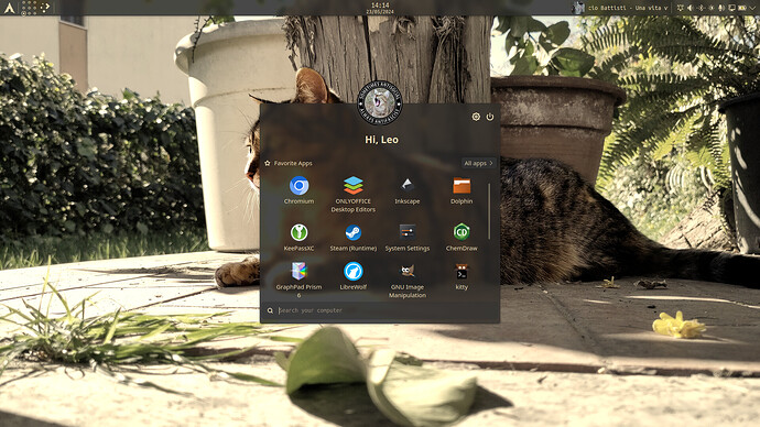
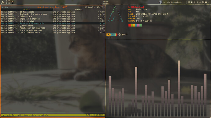
Nice, minimal but functional changes that still look great aestheticly
That looks great
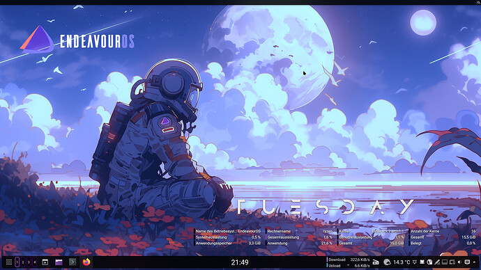
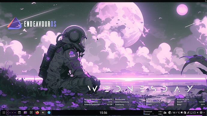
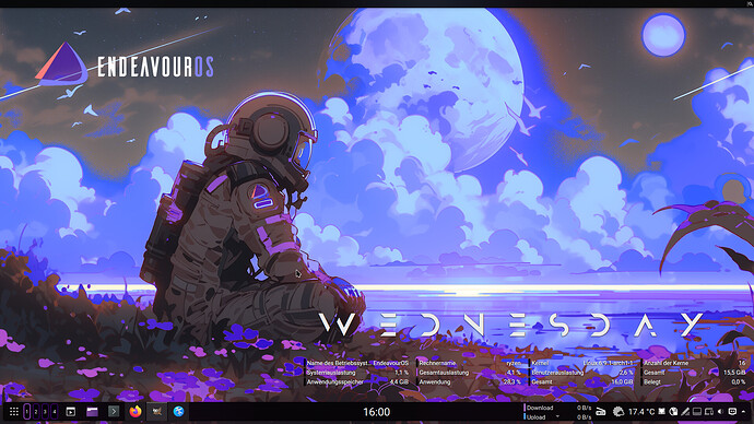
Thank you mate. You are right. Bit more transparency on the eos-logo and everything is cleaner. I like the red/brown flowers ![]() If I can get the flower colors to match the color scheme of the logo, that would be really perfect. All in all, my third day with gimp. Slowly, the stuff is starting to look good
If I can get the flower colors to match the color scheme of the logo, that would be really perfect. All in all, my third day with gimp. Slowly, the stuff is starting to look good ![]()
This might be tricky but looks quite possible also. I would try a colour threshold and add a transparent layer to it then delete either the white or black and either fill the space or use an alternative image in the layer behind it to get the colours. Not sure how much sense that made lol, running on fumes at the moment
![]() I think I will take some time tomorrow and try to put your suggestion into practice.
I think I will take some time tomorrow and try to put your suggestion into practice.
Let’s see what happens.
Yer mad the more you mess around and experiment the better you will become hey
Looks nice, welcome to the forum @Ganimede
Welcome @Ganimede ![]() Enjoy the purple ride
Enjoy the purple ride ![]()
welcome to the fun ![]()
I Love that!
I use the same outfit while the black flies are at there peek.
dam its very cool
