Thanks, I’ll change the binding to Mod+D tommorow.
2 Likes
Hey, bump, remember to try it out! 
2 Likes
I’m installing on a VM. Meanwhile I was going through the dotfiles.
to backup existing files, use cp with --backup=t
cp -r --backup=t $src $dest
1 Like
Yeah, I was just going through quickly. Nice trick, thanks!
2 Likes
(no, I didn’t forget about this, still waiting for people to try it out! can’t quite do anything without feedback )
5 Likes
I promise I’ll spend time with your config once I have my real life and higher priority tasks sorted. Even the openbox edition is pretty stagnant. 
Grateful to you for extending your help and time. 
4 Likes
Hi @codic12
I tried Qtile configs today. I’m not a regular user of Qtile, so cannot comment much on the functionality part. I’ll give some UI suggestions from initial impression.
-
Please add some paddings the the top system bar.

Right now, the text seems to be too close with edges.
-
“shutdown” text at right side of bar can be replaced with an icon, which when clicked pulls up a menu with options for logout, shutdown, restart etc. If Qtile has its own library for making menus, then use that. Otherwise feel free to modify and use the power menu script from bspwm edition.
-
Same with date. Prefix the date with a calendar or clock icon. You can get icons from Font Awesome or Nerd Font.
-
If possible add some color. Not a necessity, but having some colors on the bar ensures it does not look dull like a slate. We cannot make it too much flashy… For the polybar in bspwm edition, I did not use the Arc color that I was supposed to. I instead used color from Ayu palatte. Add some transparency, and nobody notices that the color scheme is different. Feel free to go with whichever background color you like as long as it is bluish, dark or similar to Arc background color. For icons, any color that doesn’t feel too bright for eyes.
-
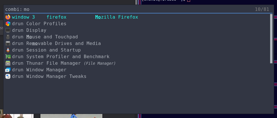
Rofi is displaying windows and apps in one list. So they are prefixed with “window” and “drun”. I suggest that you either remove those prefix (if possible) or else use two different menus. One for drun and other for windows.
4 Likes
I’m here because after an initial 18 months of Linux using Ubuntu I’ve been looking to evolve my setup and this weekend DistroTube’s and OTB’s videos got me interested in Qtile and Arch. I’m not sure that I can offer a ton of constructive feedback yet but I did want to say thank you to @codic12 for putting this together and I will be following along and trying things out.
As someone new to Qtile and display managers may I suggest a tweak to the setup notes. After installing pacman I ended up cloning the repo and installed the packages and ran the setup.sh script. I then installed LXDM (and will be looking at other display managers) and ran that, selecting Qtile as the environment to log in to. The step about starting Qtile and setting up a display manager threw me because I think that this needs to be done later on.
If I get the chance, I’ll do some proper playing over the next few days and give you some proper feedback but in the meantime, thank you again for putting this together.
6 Likes
Welcome to the forum and EndeavourOS! 
3 Likes
Welcome to Endeavouros forum
3 Likes

2 Likes
Welcome, have fun with eOS and thanks! 
This is meant to be a community edition, so I think LightDM would be set up by Calamares when it’s actually shipped. I’ll add a note to the README anyways.
2 Likes
Thanks a lot for the feedback!
Hmm, I think it looks fine to me. I can make the bar bigger (iirc I set it to the default 28 px? not sure right now) or make the text smaller, what do you feel would be better?
This is a great script, I’ll replace the [shutdown] menu with an icon / text with nerd font widget that pulls up that script. Thank you!
Which font should I use that’s available in the official repositories? Should I just bundle in a font ( I think bspwm or sway did this with Iosveka )?
That’s true. I also realized I didn’t git push the autostart.sh script that I set up a startup hook for, so you probably aren’t running the compositor. I’ll fix that. I think I’ll look at the other editions for inspiration, adding a bit of color to the various widgets sounds like a good idea (also I think the color is too low).
I actually like this on my personal setup, but i’m going to replace it with the rofi config used by maybe the bspwm edition, with some modifications.
Thanks for the feedback!
2 Likes
Font awesome is available in community repo as otf-font-awesome. Their cheat sheet to copy paste icons is here ![]()
Nerd Fonts includes Font Awesome and multiple other icon fonts as one package. But they can be sometimes lot more difficult to work with. If you decide to go with Nerd Font, install ttf-nerd-fonts-symbols from community repo. Their copy paste cheat sheet is here ![]()
There is another package : ttf-nerd-fonts-symbols-mono. This has monospace icons, but from my experience, this has problems with sizing. Some icons will be too large, some too small.
For polybar in bspwm edition, I used a specific version of Iosevka. Back in 2020, I struggled lot with Nerd Font and their sizing issue. I stumbled across Iosevka, and one of its variants gave perfect results. So instead of using Iosevka package or anything, I have added that font file in the repo. Gonna ensure that it does not break in the future and any future maintainer doesn’t need to face the headache that I did.
Note that the powermenu script I shared requires Nerd Font.
Bar height is ok; don’t increase that. My polybar uses 29px height. Font is 6px. I’ll play around with the values and see which size suits Qtile bar. I guess I’m personally more inclined towards designs that have more white space. If you think the current sizing is ok, you can leave it as it is. (We probably need more people to test and share their suggestion on this)
Take this as my personal opinion and not on behalf of EndeavourOS or any developer: When we make a product, we need to strike a balance between functionality and good presentation. The same ISO is going to be used by power users, as well as reviewers - so apart from functionality, some “polishing” is going to be necessary.
Two more suggestions:
- Add this line to
setup.shsudo pacman -S --needed - < packages-repository.txt
- If Qtile allows, you can add extra features that are disabled by default. I’m leaving this totally up to you and adding them is not necessary by any means. In bspwm edition polybar, I added some modules that are disabled by default because it didn’t suit a “default config”, but many users like to have those modules (network speed, mpd), so I added module code but did not enable them. Users who want can simply enable the module without needing to theme module with right colors and all.
Copy over all content from setup.sh to a new file called qtile-install.sh. To this new file add the pacman command.
sudo pacman -S --needed - < packages-repository.txt
Cannot add it to setup.sh directly as this is used by Calamares.
2 Likes
I haven’t looked at it in this specific case, but in general, this is a terrible idea.
You should not automate the mass installation of packages from the AUR. If it is not in the repos, it is uncertain whether it can be trusted, and each package has to be evaluated by the user when it is built and installed. Regardless whether the user is using an AUR helper like yay or building packages himself.
3 Likes
It is ensured that the packages come from official repo. Furthermore, the package list is supposed to contain the packages that are anyways going to be installed if the user were installing via Calamares.
Community editions do not use any AUR package.
In general, certainly yes.
2 Likes
Then don’t use yay, use pacman. Mass installing packages with pacman is generally safe, so there is no ambiguity in the code, it is instantly obvious that all packages come from the repos. Also, if a foreign package slips in by mistake, an informative error will be displayed.
4 Likes
I’ve changed the command in my earlier post. Gonna check existing repos too.
Thanks 
2 Likes
Great, I’ll add some icons from the package and add this to setup.sh.
I see, I’ll try different variants of fonts until I hit upon something that Ieveryone likes.
If I change the font I’ll probably change the font size too, I’ll also play around and see.
This is very true!
Indeed, I can add the pacman command to a separate file. Using pacman instead of yay also ensures we stick to repository packages.
1 Like
Progress. I added a clock icon next to the date and made the power menu pull up the script used in the bspwm edition.
1 Like