would be great to see how far off I was lol
1 Like
I’m not 100% sure if my understanding on OP asking is correct as well ![]()
1 Like
I think they flat out said that which is what prompted me to do a rough mockup
1 Like
Super good to know! ![]() It’s the little tricks like that which make a DE feel like home.
It’s the little tricks like that which make a DE feel like home.
1 Like
100% I think I mentioned it in another thread but I learnt the other day I could turn off my monitor on the lock screen with the esacape key. Super handy since I normally turn it off myself (I don’t like using screen timeouts)
1 Like
Cool this is going in the Plasma Tips and Tricks thread.
@smokey if you have such nifty tips please add them to the thread.
2 Likes
We get that, but what happens when the layout is Flipped? Can some screenshots of the desktop, KDE Launcher, etc be shared to visualize what will be the change. You know something like, before and after screenshots?
Sorry for again asking for this, as I am having trouble visualizing this. ![]()
Is this for use only with those languages which are written right to left?
Correct me if I’m wrong, from what I understand, layout filp is only for the systray icons, not the settings. Did I understand that correctly?
yep that is my understanding too.
Got it, my suggestion is more on how to organize the settings, because the OP said there are too many spaces there when OP put these setting on 3 rows.
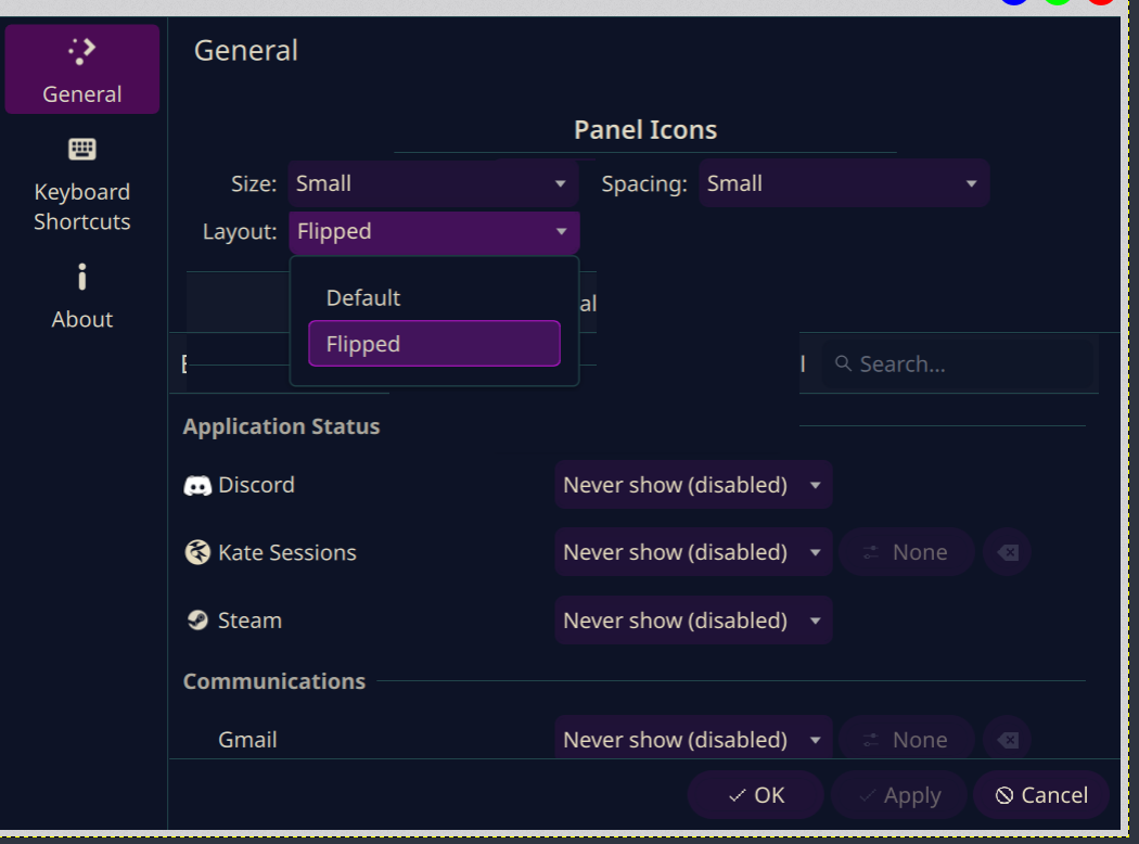
Not quite haha, here is a better visual that highlights the actual problem a little bit better.
As you can see, the “Panel Icons” header with the line underneath it creates a large gap above itself, which is quite unsightly.
Also, the “Flipped” and “Default” labels intelligently adapt to your panel orientation and locale in the current iteration. You are right to be confused. If you take a look at the other screenshot, you can see it now says “Left-to-right”. The other option is not visible, but it says “Right-to-left”. If the panel is vertical instead of horizontal, they switch to “Top-to-bottom” and “Bottom-to-top”.
@Archie1, in case that isn’t enough to clear up exactly what the setting does, it allows you to reverse the order of the icons in the tray, including the arrow icon that expands the tray to show your hidden items. I did this to allow for more flexibility. If you want your system tray to be on the left side of your horizontal panel, you can now flip the whole thing so that the arrow stays anchored on the left side.
1 Like
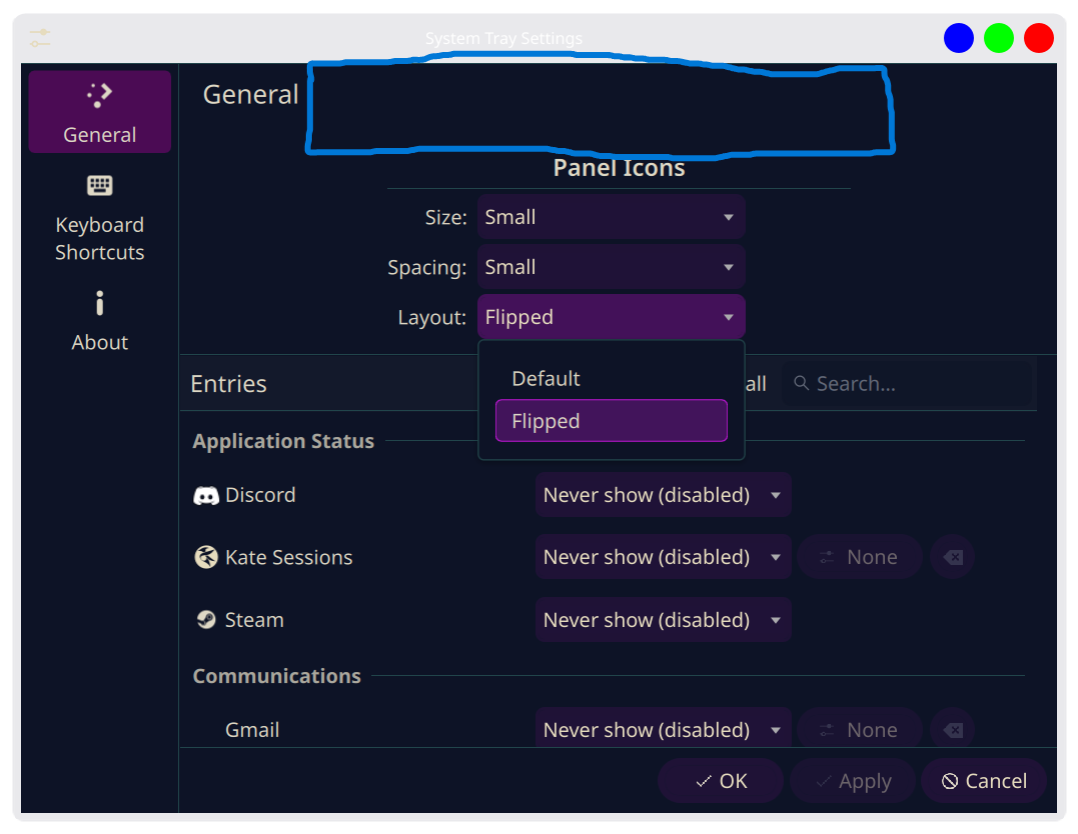
Here’s my really crappy Kolourpaint of how it should ideally look in terms of HIG guidelines for Plasma ;
- Imho that panel should be split into two tabs e.g. Entries and Appearance.
- In Appearance I would go with “Icon size”, “Icon spacing” and “Layout direction”. No section, a section makes sense if there are more than one. If it feels important then rather rename the tab from Appearance to Panel Icons.
- If a section is used then live with the empty space of that famework element. Everybody is using, it looks awkward everywhere. It is an incentive for the framework devs to improve it.
1 Like
Now there’s an idea, haha. Honestly though, I strongly agree with @Schlaefer that separating them into dedicated menus instead of trying to shoehorn a bunch of stuff into General makes the most sense. Having a generic General tab totally works when it’s actually full of disconnected, miscellaneous configuration options, but there’s a clear dichotomy here between what is displayed and how it is displayed. Absolutely a conversation worth having with maintainers.
2 Likes