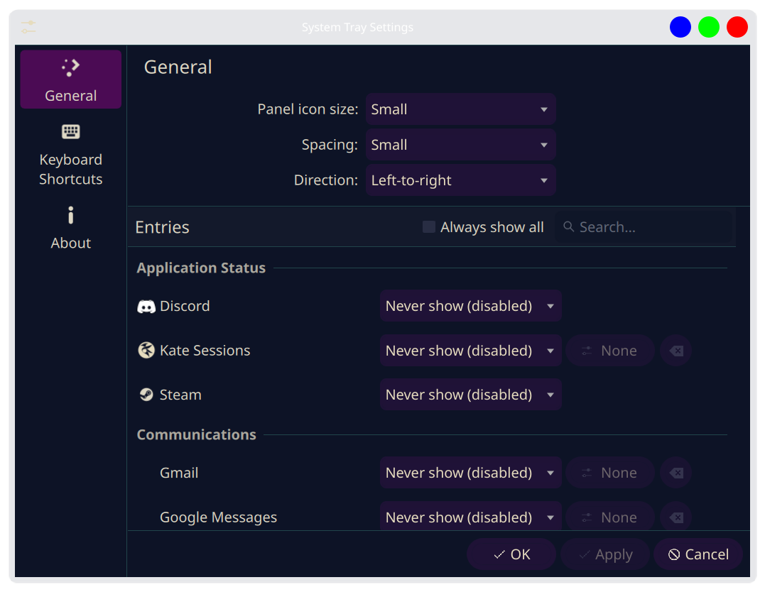
My system tray reversal feature was accepted into the mainline! Users on rolling release distros should expect to see the new configuration option in their system tray around mid June. With that said, I’m not quite 100% satisfied with the UI layout and was curious to see what everyone else thinks. Here is what it looks like currently:
My goal was to consolidate the repeating “Panel icon” label in front of each setting. If you just right click on your tray and then click “Configure System Tray…” you will see exactly what I mean.
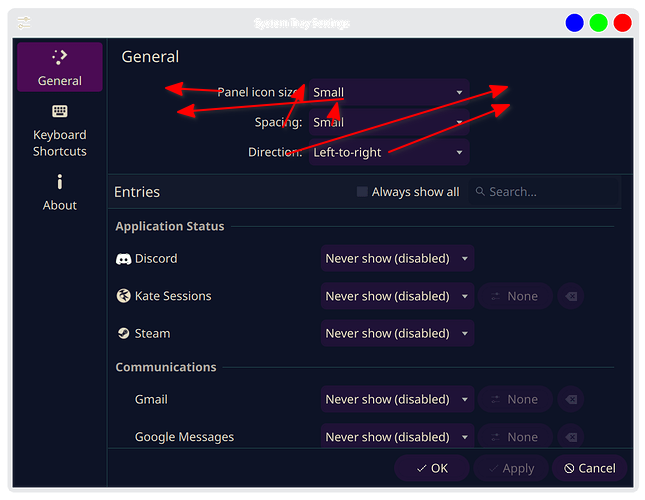
Originally—as per the Human Interface Guidelines—I had solved this by grouping them under a new heading as seen in this screenshot:
The problem is that doing so created a large empty space above those three settings, which @ngraham fairly recognized as “a bit ugly.” I agree with him; however, I do think the implemented solution is still not perfect (only prefixing one of the three settings with “Panel icon”), and I’d love to hear your thoughts.
Would you prefer the original grouping with the empty space, the current compromise, or do you have an entirely different layout in mind? Please discuss.
I think I prefer the layout of the second screenshot. But as it’s not a screen I will see or use a lot, I have no strong opinion.
But it’s great to ‘meet’ someone who has the skills and the will to help improve FOSS products! I’ve never been able to do more than a few translations or do some work on wiki’s, sadly.
Edit: changed ‘top most screenshot’ to ‘secondc screenshot’. I was not quite awake when I first typed this post. Sorry.
While it’s something I’d never considered, or used, it’s great to see more flexibility, thanks for taking the time to describe this so clearly in the feature request! One thing I’d love to see is the change to order system tray icons, not just hide or disable them. Beyond that, it’s very rare that I really do anything other than check weather, the clipboard, or num/capslock status from the system tray.
In terms of the UI, why not align the Panel Icons to the rest of the entries on the left, so that we’re not seeing mismatched alignment for the dropdowns? That way you can just make the “Panel Icons” section in the same way that “Entries” is formatted. In my subjective opinion, it looks weird centred.
I’m having a bit of a tough time visualizing exactly what you mean by this. Would you be open to possibly constructing the layout in a spreadsheet or something?
I agree, the second screenshot is the most consistent. The ideal solution, in my opinion, would be to simply add styling to the “Panel Icons” header that reduces the gap above it, but I’m not quite sure that’s possible with current QML syntax.
You may be over-selling my competence! Lol. I’m definitely not a newbie in the “Linux ecosystem,” but I’m also not as much of a programmer as you may expect. I intend to learn QML so that I can be that guy, but as it is right now, I really only know basic Python. I’m really just a Plasma user who wanted specific functionality that wasn’t there, and I’m stubborn enough to fight an LLM for days to make it happen lmfao. Certainly much more will than skills; the hardest part was navigating GitLab, but I’m perfectly okay with that—baby steps. Now I know for next time.
All good—we’ve all replied to someone before being fully awake. Haha.
You are absolutely not the only one; a large portion of the people I’ve talked to about this have said the exact same thing. I plan to at least take a stab at it, but from what Google Gemini has said, it’s going to be a much more complex undertaking. I wouldn’t get your hopes up too hard about me specifically being able to make it happen, but it seems—to me—like there’s enough chatter going around for someone to get on top of it sooner or later.