I moved the EndeavourOS Logo up a hair. I also slightly moved it back to the left a little. Which do you guys like better? This or the one I posted before this? I kind of like this one a bit better. IDK
EDIT: Yeah because if your dock is on the bottom. The EndeavourOS logo is to close to it. IMO
NOTE: I did not center these or line them up technically I eye-balled-it in this instance so yeah just FYI
Due to my OCD I do not use this wallpaper for that reason.
Created in Gimp with a purple wallpaper already on the net. Applied an EndeavourOS logo on top of the image & centered everything.
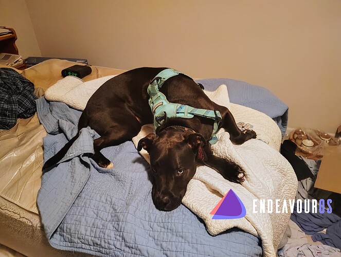
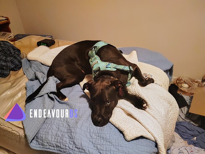
someday put a small purple dog (a picture of yr dog) traveling thru the space landscape on one of the purple ones. Small enough so it’s tasteful and playful at the same time. Not sure it can be pulled off though.
Nice work. Downloaded the last one–sometimes its nice not to have the word, just the logo.
I’m eating with my dad at Russ’s restaurant but I concur with those facts. ![]()
![]()
![]()
And about doing a wallpaper with my dog and endeavor logo.
Thanks for the suggestion I need to get on that I’m not exactly motivated person though or highly motivated. I mean so… I’ll get to it when I get to it kind of thing, but it does sound like a fun endeavour!
![]()
Glad you used/liked my art. ![]()
Very nice! Thanks for sharing your work.
Very nice. How about one just like #2 but with out the EndeavourOS logo and writing?
