TL;DR
Fonts in many apps render poorly. Blurry, inconsistent, thin, frail, hairy, and ultimately hard to read especially compared to Windows, macOS, Android and iOS. I’ve tried numerous configs, tweaks, and even patching and recompiling software, to no avail. Screenshots/demos are at the end.
Preamble
This is a long post to save your and my time with common solutions. The reason it’s this long is to provide as much context as possible. I ask that before you give any advice, you read through it completely.
I am aware there are a couple other posts about this issue dotted around on the internet, but they are all either ancient or dead and inactive, and perhaps lacking in detail.
I am posting this in the Newbie forum simply because I don’t know any better place for it. I’m not familiar with the EndeavourOS forum. Feel free to nudge me elsewhere if this isn’t right or too big. I’m not that much of a Newbie; I may not use Linux on the desktop that often, but I know my way around it to an extent.
The problem
Every now and again, as a person who dislikes Windows and macOS for many valid reasons, I like to give Linux a shot. EndeavourOS has been wonderful to me in all other regards, from ease of installation to stability to not getting in the way. However, font rendering, honestly speaking, is horrible. This isn’t necessarily an EndeavourOS problem, and I am not blaming anyone, but It’s disappointing and frustrating to have a desktop OS that is seemingly incapable of rendering text nicely. See demos at the end of my post.
This happens to a very wide variety of software - I have this issue with:
- Falkon
- Firefox
- Ungoogled Chromium
- Google Chrome
- Vivaldi
- Microsoft Edge
- Discord
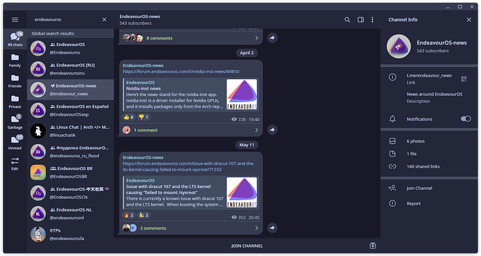
- Telegram (until more messing with various font configuration files)
- Spotify
- Visual Studio Code
And I’m not sure, but perhaps also GTK apps like EasyEffects and Mission Control are also affected. Their fonts certainly look worse than included KDE apps like System Settings, where font rendering seems perfect.
There are so many more common apps that are simply bad to look at. This is enough to generally discourage me from using my computer, since the issue is also exacerbated by my own eyesight. This is all on KDE Plasma, but I also observed this under GNOME. I haven’t tried more DEs, but this definitely seems like a deeper rooted issue than a DE bug.
I understand that this might just be a browser engine problem. After all, Chromium owns us all… Except, it happens on Firefox, too, with no real way to fix it there either.
It looks broken enough that no reasonable person should chuck it up to “different font rendering” and “don’t try to turn Linux into Windows”. This is broken, and incorrect, and it can be better as observed in some apps. The issue is most apparent on dark backgrounds and light text which is small in size. By small, I do not mean tiny, I mean like the text you are reading right now.
Environment
KDE Plasma 6.3.5 on Wayland (same on X, fwiw)
- My display is not HiDPI - most people don’t have those. That is not to say it’s low-resolution,
3440x1440is perfectly adequate for displaying text. Its scaling is set to 100%. - All common fonts, including proprietary such as Arial or Times New Roman, are present and installed.
- In
/etc/profile.d/freetype2.sh:
export FREETYPE_PROPERTIES="cff:no-stem-darkening=0 autofitter:no-stem-darkening=0 type1:no-stem-darkening=0 t1cid:no-stem-darkening=0"
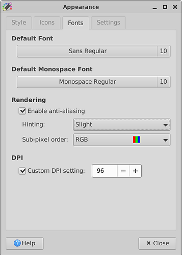
- In various places around the system, anywhere where it’s available, I’ve set my fonts to be rendered with RGB subpixel rendering enabled, with slight hinting. I’ve been fighting this for weeks, so I’ve probably set everything there is to be set. This allowed Telegram, for example, to look as good or better than Windows, with perfect sharpness, font weight consistency and general “niceness”, and I’m still not sure what I did to make it be like that.
- I may occasionally have themes or color schemes applied. Rest assured, they don’t actually affect the font rendering much, it’s still just as broken without them, and it was like that from the moment I booted into the freshly-installed OS.
This is far from an inferior or inadequate setup. I am not looking for answers in the vein of “just get a higher density monitor bro”.
Things I’ve tried
There are so many it’s hard to list accurately.
- For stem darkening - I am well aware it is not considered correct without properly implemented “gamma stuff”, but it makes fonts marginally thicker which just as marginally helps me read.
- For
SK_GAMMA_EXPONENTand such (see here) in Chromium, recompiling it with various values does not alleviate the issue much at all. The fonts may become thicker or thinner, but are typically just as inconsistent. Patching the browser binary directly to include different LCD filters with a script I can’t find the source for seemed like the first thing to remotely help at first, but in reality it didn’t seem to resolve the core issue of inconsistent coloring and opacity, only mask it by “making everything look so bad it’s not noticeable”. - For various flags, etc, I’ve probably tried them all, like disabling Fontations. Nothing changes.
- For replacing fonts with libre ones, this is outside of the issue entirely. Let me reiterate, the issue is not the fonts and glyphs themselves, it’s how they are rendered. And this happens to all fonts, even
system-uiand such. - For patching freetype, it’s the same as with patching browser binaries - it changes the look a bit, not actually fixing the problem.
Demo
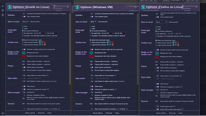
Please view the screenshot below in 100% pixel-perfect scaling. Direct your attention to how frail and hairy the fonts on Linux are. Look at how inconsistent every letter’s stem and curve within each word is.
According to DevTools, the fonts are loading correctly and are the same - Arial. As you can see below, they are the same font, just rendered differently. Linux/Vivaldi on the top here, scaled:
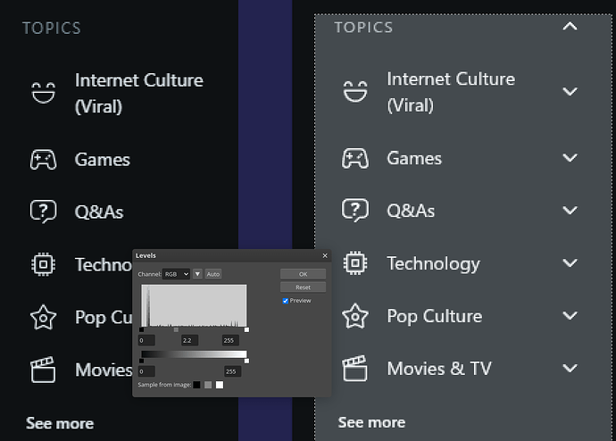
This is just one example. See below for how rough Reddit’s sidebar looks on Linux (right), vs Windows (left).
Remedy
My knowledge about font rendering is very limited - I am just an end user.
But look what happens when I adjust the levels in an image manipulation program:
Looks better, doesn’t it? The stem of the “h” in “Technology” is a bit bright but it’s certainly better than it used to be. I’m not sure what I’m adjusting here but 2.2 seems to be a sweet spot - am I applying gamma correction here? I’m not sure; probably.
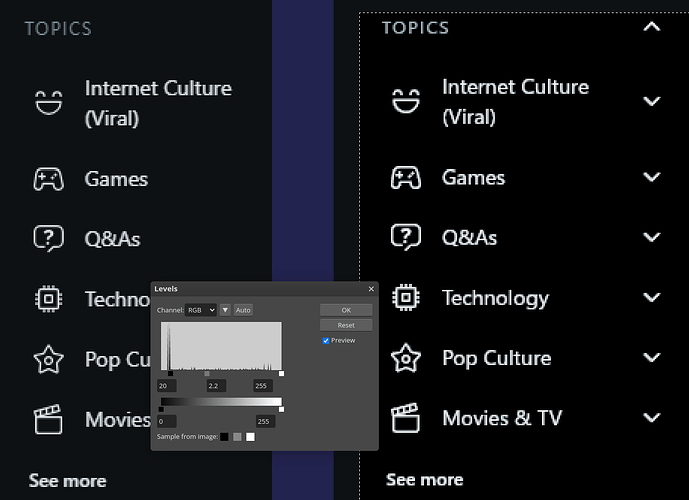
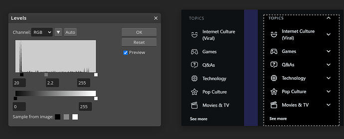
And now let’s clip the shadows a bit so it’s more or less just the text that’s affected:
This is miles better! It’s so much easier to read!
Personal remarks
Most of how I interact with a computer is reading and writing. I am writing this on the problematic system, and it is genuinely giving me a real headache because of how hard I have to try to read. When I can’t read, I can’t interact with the system. When fonts are, simply put, annoying, it’s a massive distraction from doing any work or consuming any content. My eyesight is pretty poor, as well, due to astigmatism I struggle with light-on-dark text as is, but I’m not willing to get a headache from a bright UI. This issue makes everything so, so much worse for me.
I understand that most people just don’t care, everyone I’ve asked basically told me they’re blind to the difference. I’m not, and I really hope my post pushes someone to propose and implement some sort of solution. Linux is infinitely hackable and open, it’s baffling that this is an issue in 2025. It’s one of the last unsolvable walls before I can seriously start choosing Linux instead of Windows in my boot menu every day.
