Look at the emoji smile face in red circle:
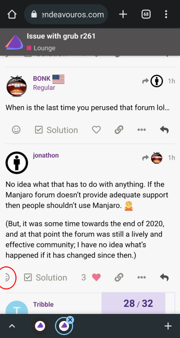
Look at the emoji smile face in red circle:
The emoji icon didn’t fit so it is partly drawn, nothing unusual. Use your browser in landscape mode ie. rotate your phone by 90 degrees so you have longer horizontal space.
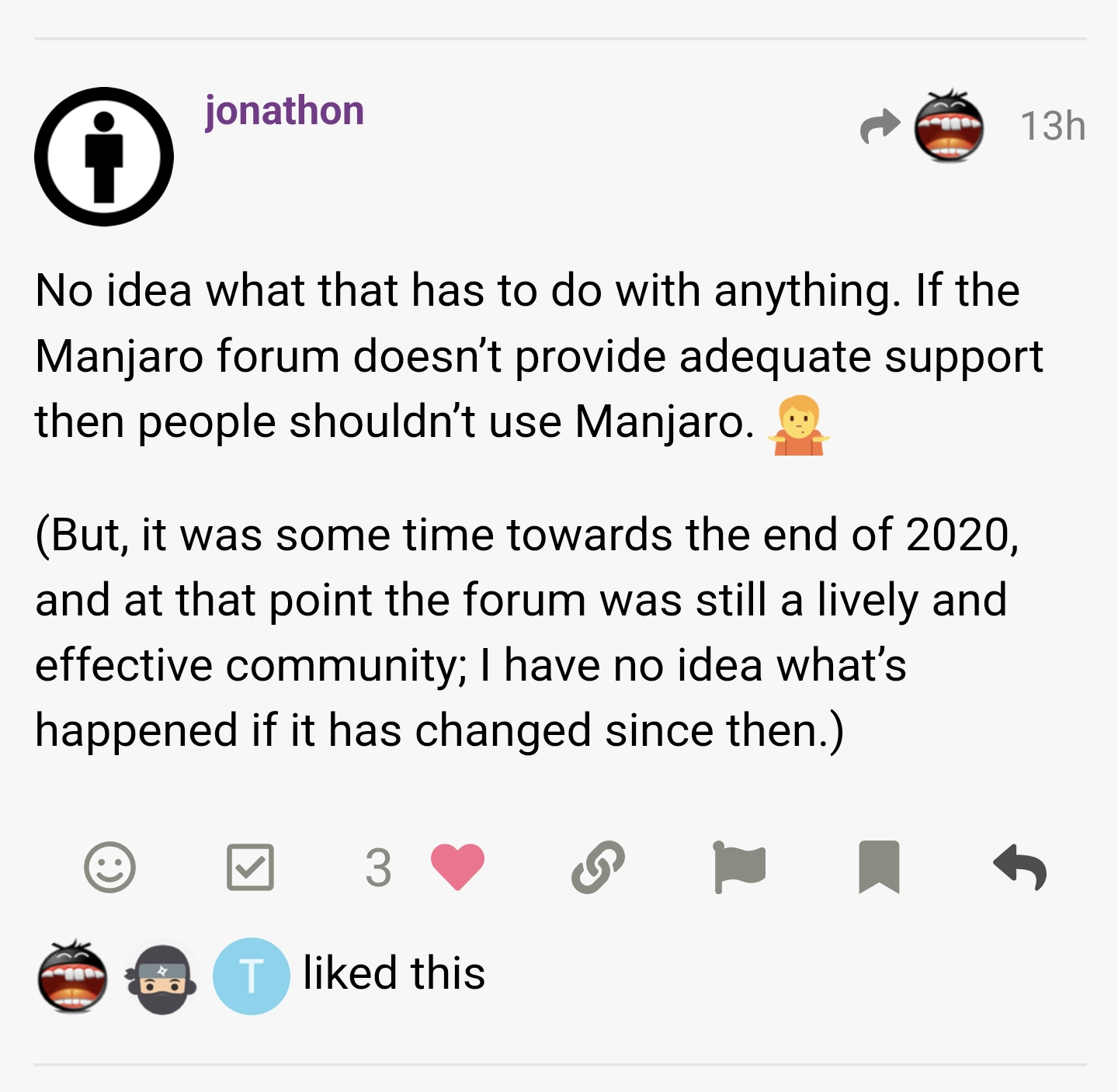
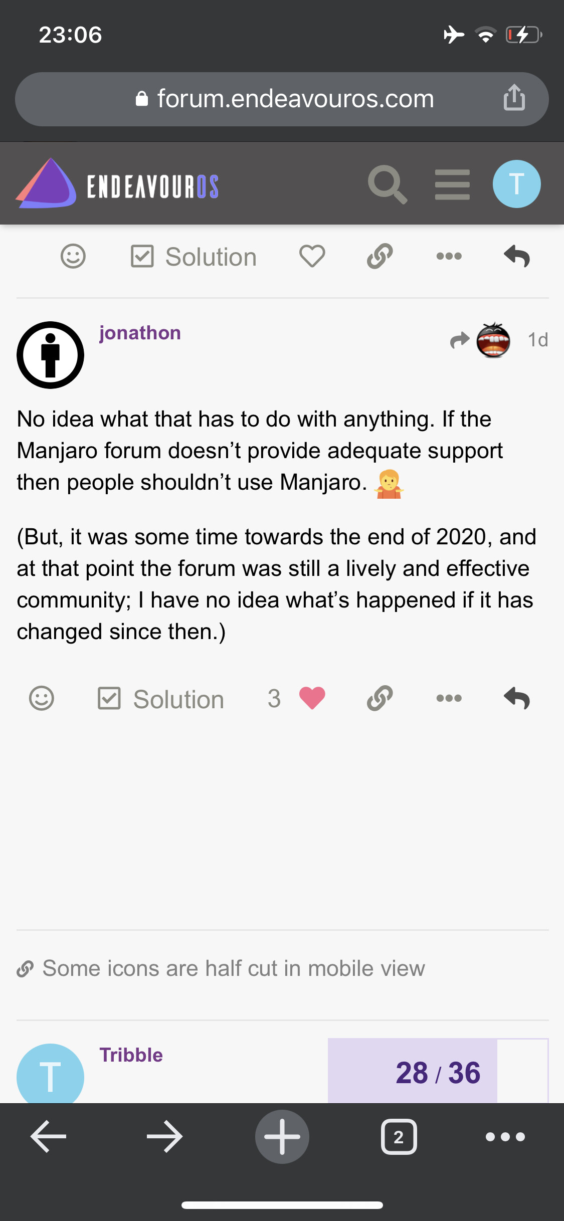
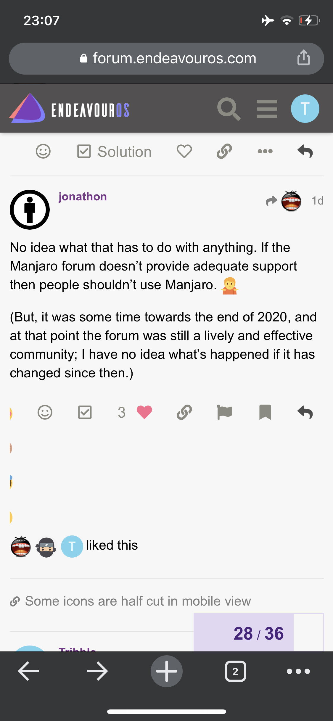
It’s website issue that doesn’t reflow correctly. Clicking on the 3 dots (…) converts the post action from one line to two:
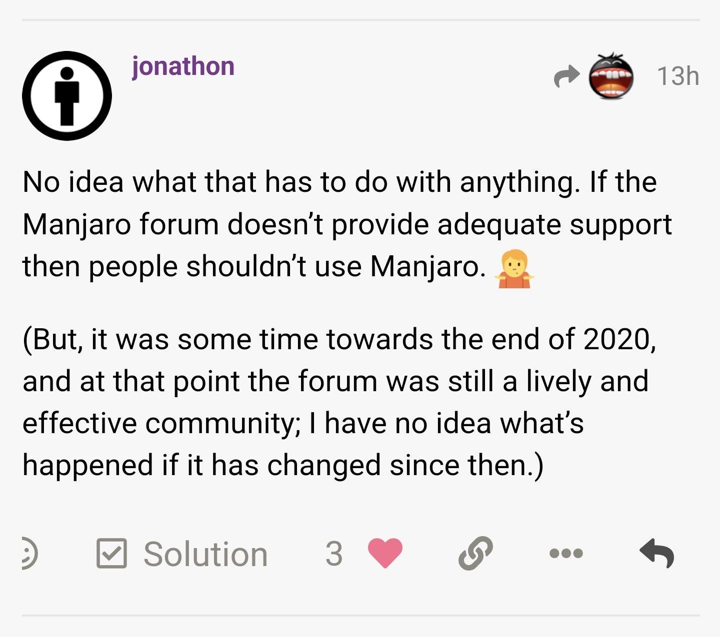
I cannot reproduce it, on my phone the forum looks like this:
Go to this post, click on the smiley face and add a reaction, then click on the 3 dots.
Here is a screen recording adding some reactions to the post and see how it looks like on the iPhone X with web browser Firefox:
The first picture is from a Samsung android phone.
This is on the iPhone X with Google Chrome:
Same with Safari.
You are talking about a post with quite some emojis in it, a phone screen is limited. Also the emoji button we are talking about, retort, isn’t an official Discourse plugin, it has some quirks in its layout.
This is something we cannot change and it is up to the maintainers to go with the upstream updates Discourse is providing.
The last commit was 14 months ago.
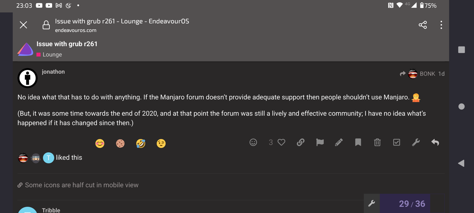
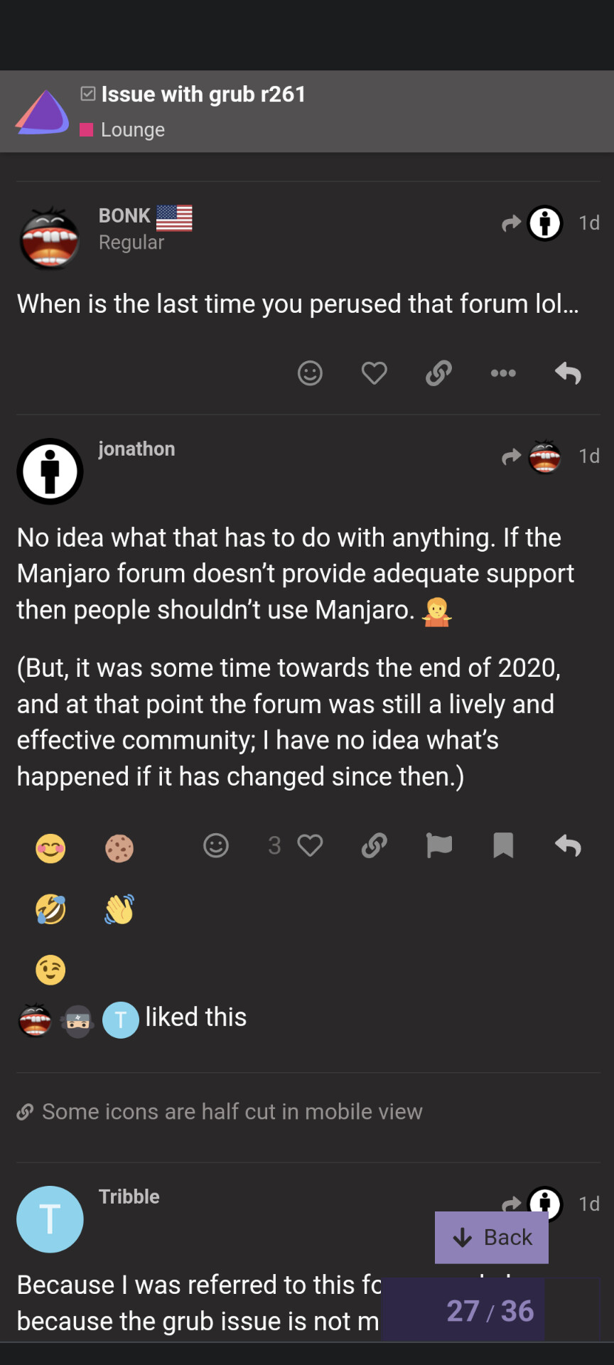
I know just reporting the issue. Just don’t say that the issue does not exist.
As I said before, I couldn’t reproduce it because I didn’t take the steps you described later. I didn’t say it didn’t exist, not reproducing an issue and denying it exists are two separate things!
I can’t reproduce that neither. Perhaps some display settings on the iPhone x. I use android pixel 6.
The OP is referring to a post with a lot of retort, the emoji selector on the bottom, emoji reactions in it. In that case screen real estate becomes an issue.
Retort hasn’t been worked for over a year, so I think that project is dead, for now.
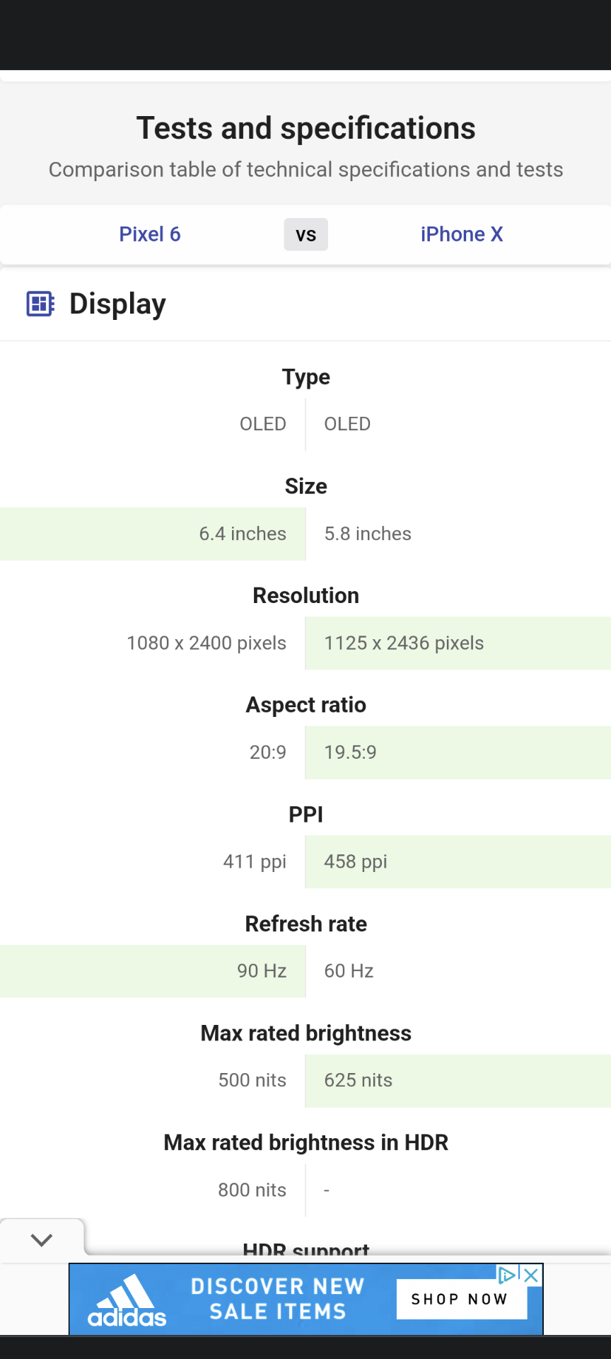
Also can compare pixel vs iPhone, I think mine is wider. Maybe the same problem with OP Samsung.
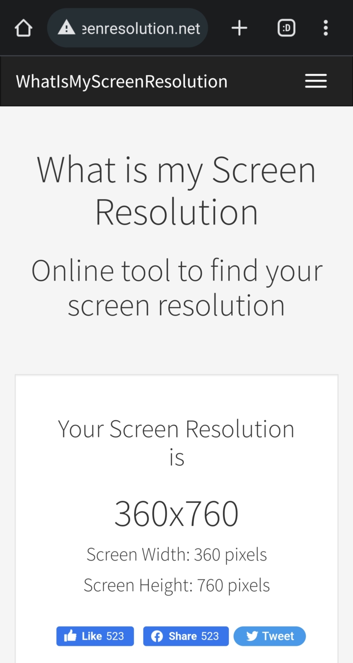
The viewport size of my Samsung device is 360x760:
Screen resolution is 3040x1440, but I don’t think that’s suitable for mobile view:
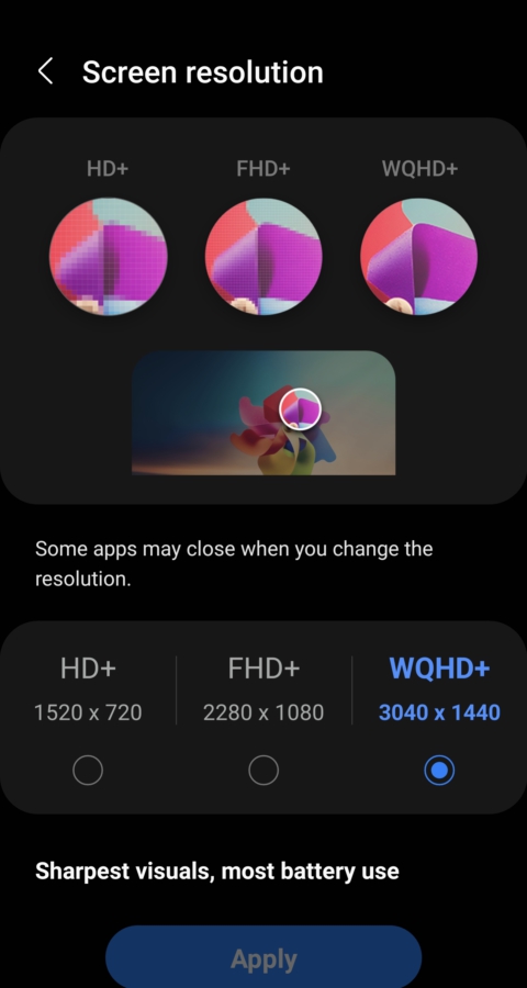
If I switch to desktop view keeps same viewport size.
Will post later on my iPhone’s one…
Here are the viewport sizes for the iPhones, no need to take any screenshot:
I wonder if you have changed some setting in your forum profile settings, or are you using the endeavouros app?
There’s an app?
I can tell you what worked for me, what i did was this increased the size of individual app icons. However, there’s an indirect method that affects not just app icons but also the overall text and interface element size on your device. Here’s how:-