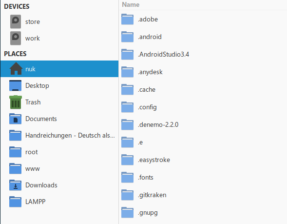
I agree that Endeavour needs it’s own visual cues. I always liked Antergos for that reason with Numix. I also agree with @Beardedgeek72 about the Manjaro identity although i do like Papirus Icons. I have run Manjaro Cinnamon and it looks great. Not so warm and fuzzy on Sardi.
That said the standard papirus icon set (not Maia) has blue icons that matches Arc blue.
Yes i agree. I just think Arcolinux has gone too Sardi and i don’t want Endeavour to do the same. Nothing wrong with Arcolinux don’t get me wrong. I like it also but desktops have to be appealing and that is why people gravitate to them. They also have to be user friendly and easy to change and make it your own. In the case of Antergos i just liked it out of the box with Numix and i still use Numix whether it is Numix Square or Circle. I also like the Papirus Icon set too and i use it in Manjaro Cinnamon. But the green is kind of a Manjaro thing so like @anon31549144 say’s Endeavour needs it’s own visual cue’s. It’s like the logo discussion we had before Endeavour was launched. It matters!
Papirus has blue instead of the green of Papirus-maia.

I think Numix is also safe to use, there is no more Antergos after all, and Endeavour is supposed to be its successor anyway. It would bridge the identity gap for people used to Antergos.
That’s kind of what I’m saying. I don’t have an issue with the Papirus-Maia. But it would be nice if Endeavour had it’s own identity! Just like the logo it is instantly recognizable.
I agree with you!!!