Sans-Serif fonts look weird after update of ttf-apple-emoji

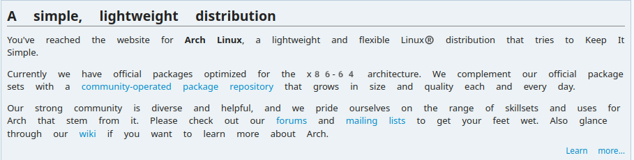
I recently updated my EndeavourOS system, and afterwards, there is too much space between the words in Arch Linux website, and the numbers also look weird.

The same issue is there in Arch Linux wiki and Wikipedia.

How to debug this?

This was Firefox.

In Chromium, the space between the words is not that much, but the numbers still look weird.

Try this in FF:

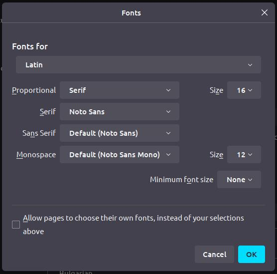
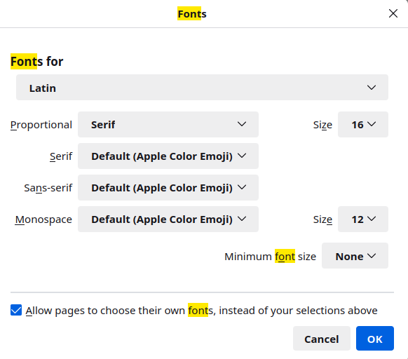
Settings → type in “font” → click “Advanced…” → check the box “Allow pages to choose their own fonts, instead of your selections above” → click “OK” button.

Somehow, Apple Color Emoji became the default font after the recent update of https://aur.archlinux.org/packages/ttf-apple-emoji

@anon93652015 I fixed it in Firefox after manually defaulting to Noto Sans in Firefox. How to make Noto Sans the default everywhere?

What Desktop are you using? Each has their own settings.
KDE is System Settings > Appearance > Fonts

The issue occurred due to the addition of a fontconfig file to the AUR package, which has been fixed https://aur.archlinux.org/cgit/aur.git/commit/?h=ttf-apple-emoji&id=c5598e82026bd48fd502439e7948135b45239820

This topic was automatically closed 2 days after the last reply. New replies are no longer allowed.