If you like this. Upvote the Gitlab page and show support! https://gitlab.gnome.org/Teams/Design/os-mockups/-/issues/93
I have been working on this new design for a few hours now and I would like to share it to you guys as well.
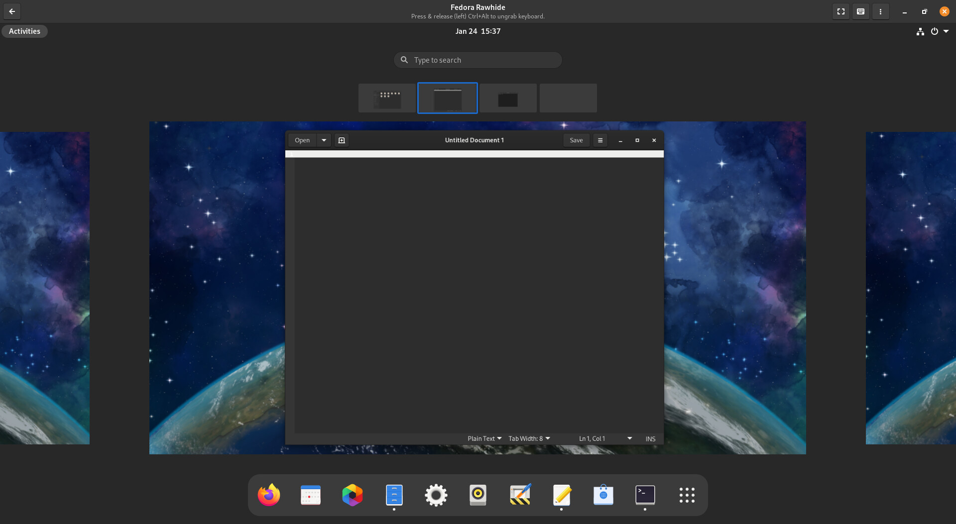
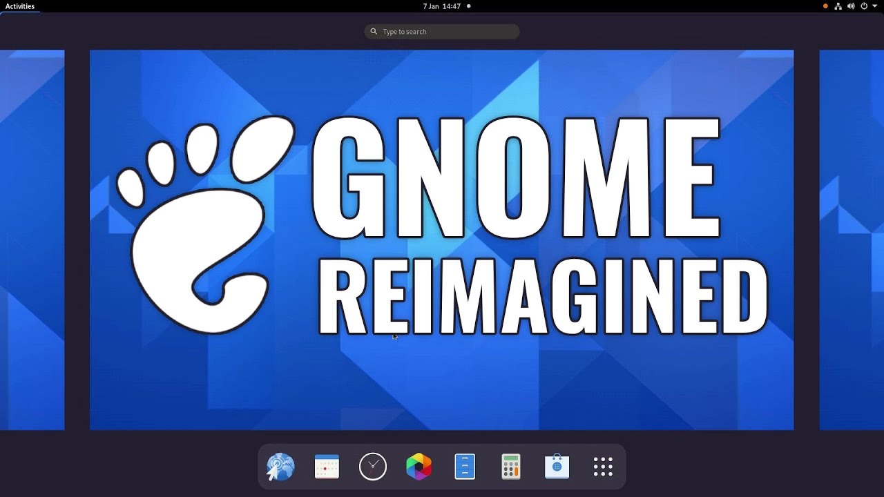
The current Gnome 40 design can be seen below.
Gnome 40 design
The main advantage of this design is that users can easily grasp how workspaces work as each workspace is represented as a standalone desktop.
However, this introduces an ugly black Overview background.
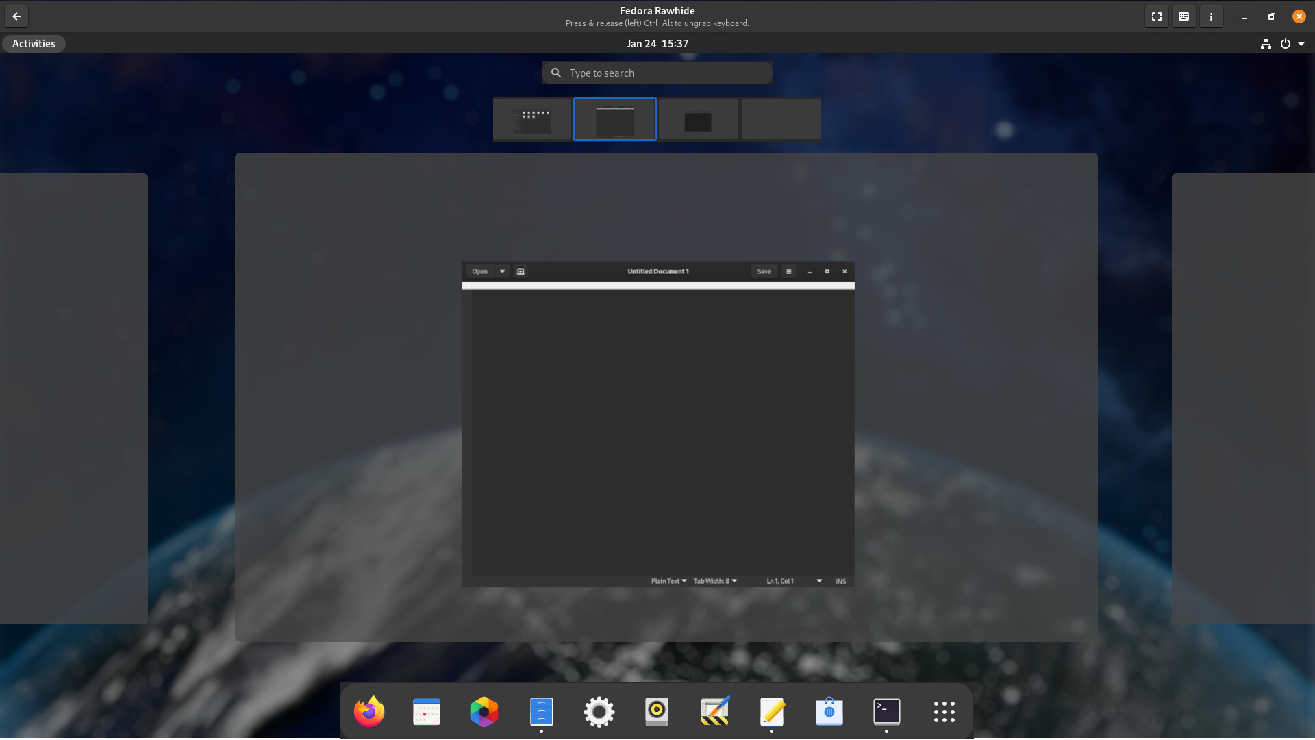
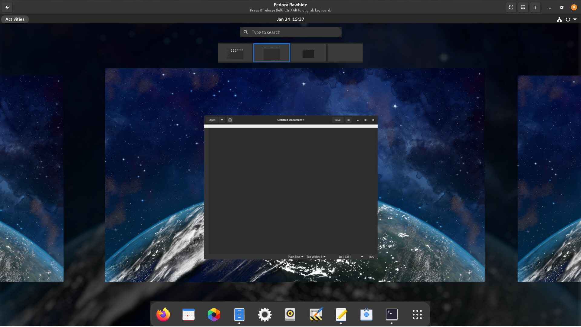
To solve this, make the overview background a blurred darkened version of the user-defined background and use blurred grey panels to represent different workspaces.
My design
This way, we can see a beautiful desktop and easily grasp how workspaces work in Gnome.


 Don’t like touch pad devices either. Web OS no thanks. Give me a keyboard and a mouse. Anything but Gnome! Sorry but I’m not inspired. No offence.