Since this is an icon theme, I believe it may fit under Wallpaper Art. If this is not appropriate, I kindly ask the moderator to remove this post.
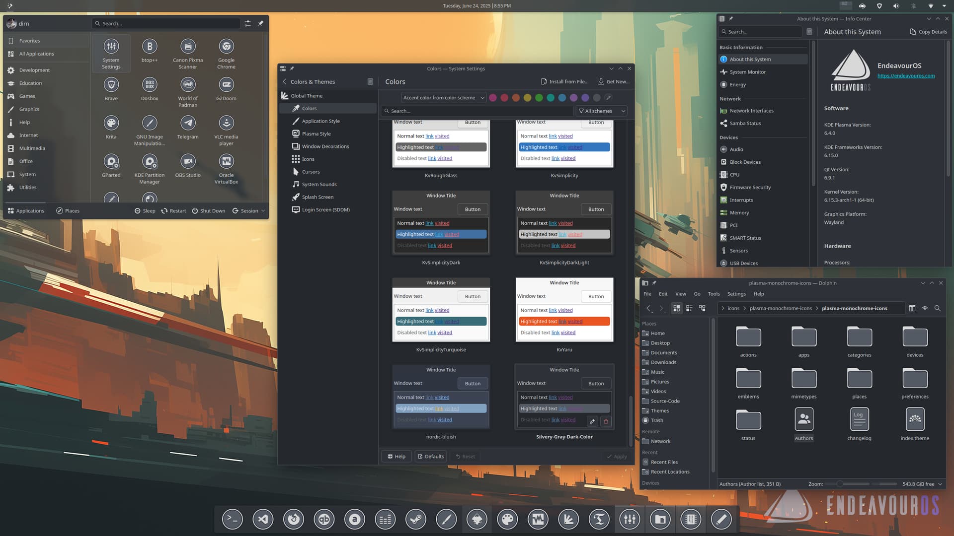
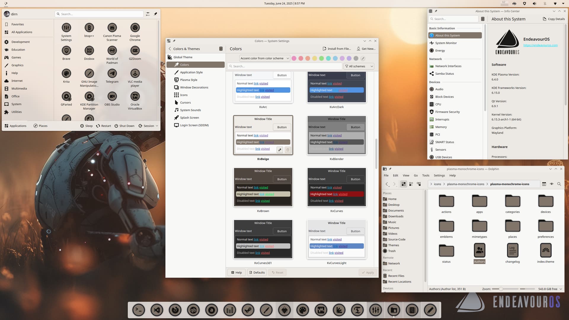
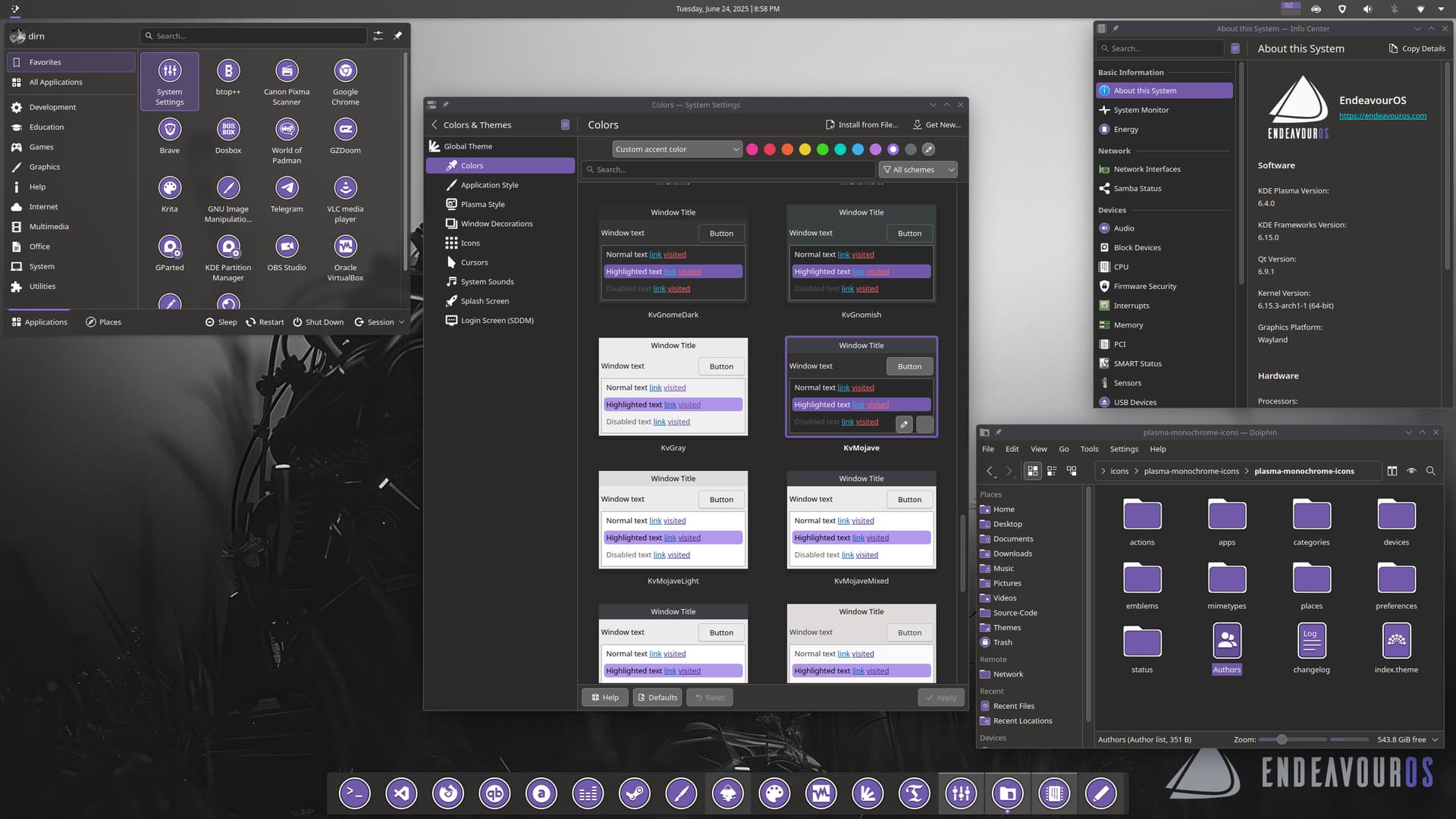
This icon set draws inspiration from the Orion icon theme, designed by Seth Storm Rosenaa. This modification aims to highlight the versatility of icon theming in KDE Plasma.
You can download the Monochrome Icons theme here: monochrome-icons.
Enhancements Made:
The foreground color is set to match the Plasma theme’s text color.
The background color corresponds to the Plasma theme’s selection color.
Looks good but not so well with the apps it doesn’t support
really love the simplicity of them. have been looking around for a black and white/monocrome set (going through the hundreds of sets I have before searching the internet.) but none of them are complete either.
Agreed, it’s really difficult to find a complete icon set. Even for this one I need to find the missing app icon some where to close the gap.
Anyway, it’s not really about the icon set that I’m trying to highlight here. It’s about the flexibility of icon theming that can integrate with KDE Plasma color scheme that interest me the most .
The support of .svg files for icons by Plasma is a good decision and really makes life easier as I don’t need to find the bigger size icon from the internet and scale it accordingly to 16x16, 24x24, 48x48 etc to patch my missing app icon.
Other DE that I used before (GNOME 2 and Cinnamon) support .png for icons. If I want to achieve something like this, it require multiple icon sets for each color scheme.
One of the reason why I’m in love with KDE Plasma .
I’m not even start with the icon naming to auto map it to the app. That’s another mystery in itself
Edit:
Correction, it looks like both GNOME 2 and Cinnamon does support .svg as icon. I’m the one who’s not aware of it. My bad.
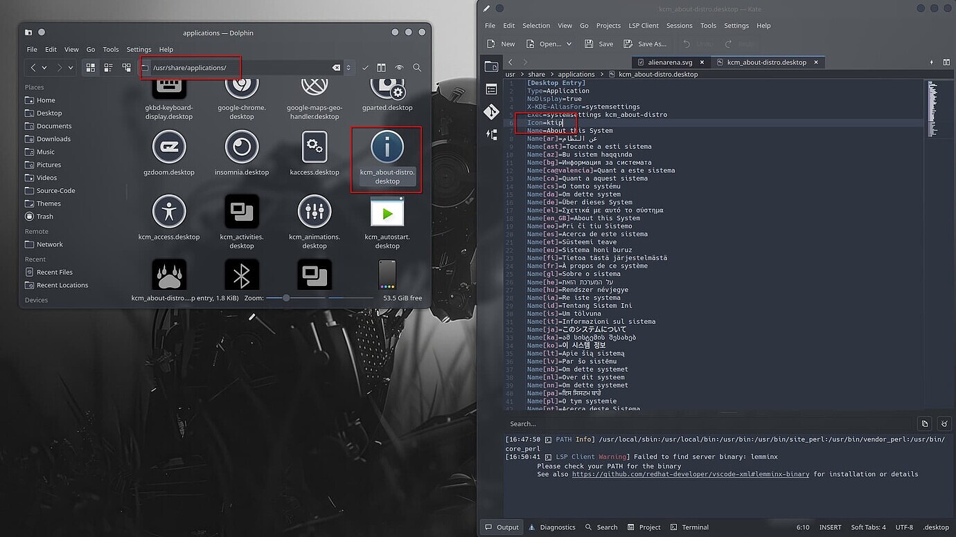
Please message me the list of missing icon name (the icon name defined in .desktop file at /usr/share/applications). That will be helpful for the mapping later
This set is really setting the Share Your Wallpaper thread on Fire. So many users sharing their awesome desktops. Such a Great Idea @dirn and @cscs for the original start menu icon.
Thank you. Credit goes to Seth Storm Rosenaa, the original creator of this icon set. I merely enhanced it to utilize the KDE Plasma color scheme feature, inspired by ideas from @cscs .
@perletero from your screenshot in Share Your Desktop thread, it looks like you’ve downloaded an old version iconset.
Lutris icon is available now. You can download the latest tarballs from the bitbucket repo link in this post.
The track changes are located in my private repository, which contains my beginner-level scripting and various experiments related to the icon. It’s a mess . I only upload the tarballs to the public repository for others to download.
Well really, I think “Theming”, rather than just “Wallpaper art” would be a better name for this sub section of the forum, since there is no “Icons art”, “Color schemes”, “Cursor themes”… “Theming” should cover it all, as they all go hand in hand.
As to your Icons: from a graphics art perspective, pretty freaking good! As for my personal taste, not so sure, but not at all unacceptable, depending on what the full color Orion set has which I will have to look at.
Be right back…
OK, checked it out, seams the whole set is limited to the white, one color, and transparency, so even at large sizes you get the symbolic look. Well, it’s a little to simple for my taste; I like my larger Icons to be in more full color, and also anything on the 3D side with perspective, highlights, and shadows… Screen resolutions keep increasing, and sooner or later our desktop size Icons could be photographic, and kind of already can in part at 64px² and up!
@dirn Thanks, those screenshots were taken when i was traveling and i had no internet to download the new version. I updated and it’s really nice but i was too lazy to take screenshots again