 yellow: less electric nightlights in 2023, compared to 2012
 purple: new/more nightlights in 2023, compared to 2012
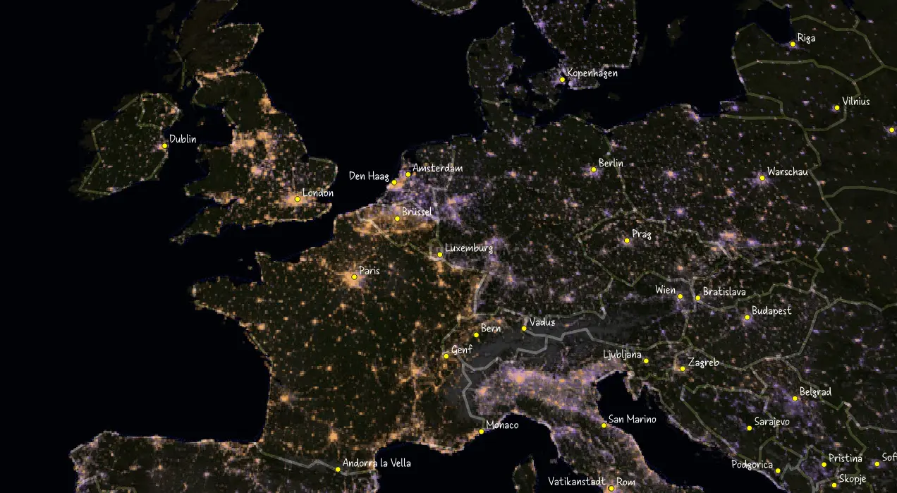
I just played with QGIS and found this.
This is part of NASA’s Black Marble composite imagery for nightlights around the world, as a comparison of 11 years (2012-2023).
Asia and most of the world is purple, indicating more urbanisation, more power consumption.
However, in Belgium, Great Britain, and France, lights went out. The satellites captured less light compared to eleven years ago. I’d say, Brexit might have played a role for the UK. The French-speaking, Southern Belgium traditionally got less economic activity than its richer, Dutch-speaking Northern parts.
EDIT