Logo origins?

I don’t think there’ll be that many more. Not everyone who uses M* has noticed all the trouble there. Many users will simply not care about the background. Not everyone is as interested as we are.

Ich glaube, da kommen nicht mehr so viele. Diesen ganzen Ärger dort haben ja auch nicht alle, die M* nutzen, mitbekommen. Vielen Nutzern werden die Hintergründe auch ganz einfach egal sein. Es sind nicht alle gleich so interessiert, wie wir.

I think sometime more will see how many supports of the forum are missing and what the admins are all about. If not, no matter what, I / we, have recognized it and have drawn our conclusions.

Ich denke irgendwann werden es noch mehr sehen wie viele Stützen des Forums fehlen und worum es den Admins geht. Wenn nicht, auch egal, ich / wir, haben es erkannt und unsere Schlüsse daraus gezogen.

1 Like

Had to switch the avatar to General Grievous to please the kid :crazy_face:

1 Like

I am not disappointed or sad about your change, I just wanted to show that I have not forgotten you :wink: which is amazing for my age :smiley:

Ich bin nicht entäuscht oder traurig über deinen Wechsel, ich wollte nur zeigen, dass ich dich nicht vergessen habe :wink: was für mein Alter erstaunlich ist :smiley:


But isn’t it very OT ??? :wink:

2 Likes

Ist nicht alles manchmal irgendwie OT?

Sometimes everything is OT?

:sunglasses:

2 Likes

I thought the logo was an airplane.

:exclamation:

Two sails and a mast I think but @nate certainly knows more about it.

2 Likes

Yes they are sails. :yum:

1 Like

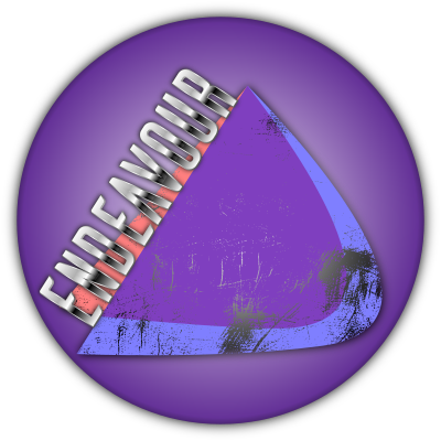
Yepp, it’s two sails. And the connection with the HMS Endeavour is right. It was a symbol for the bold new OS that was to come out. Continuing Antergos’ legacy while also sailing off to make a name for itself on it’s own path.

5 Likes

This logo definitely has an airplane on the left:

Screenshot_20200810-185517~2

2 Likes

Space shuttle :wink:

https://www.nasa.gov/centers/kennedy/shuttleoperations/orbiters/orbitersend.html

3 Likes

Nearly but that is not the Logo :slight_smile:

ricklinux-01-sgs
Logo is the scratched one, I know, @nate will hate it :wink:
EnOS-text-silber-scraatch-sgs

6 Likes

We don’t call that “cracked,” we call it “pre-distressed.”

People pay extra to get pre-distressed jeans, or “relic” guitars that look old and worn.

So you need to charge more for that one. :wink: :money_mouth_face:

3 Likes

No no no remember there is a message that a dying sailor scratched on there!

1 Like

I’m almost afraid to ask - what was the message? :worried:

2 Likes

LOL he used it in a wallpaper I liked. Big surprise! So I was themeing around it and playing with inkscape and it doesn’t say anything. He never liked that logo. So I decided that’s what the marks were. I think I have a screen with it…brb

Last one. :+1:

2 Likes

go ahead, scratch away :slight_smile:

3 Likes

Now I remember, it had to match the rest. “The Stormy Weather”
The logo is beautifully done.
I just sometimes adjust it to fit the big picture.

2 Likes

@anon3337769:
image

8 Likes