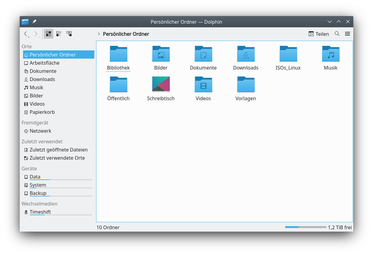
Since the update to Plasma 5.20.4, we now have these fill level indicators for the partitions in Dolphin (sidebar). I am visually disturbed by these. Are there any ideas to remove them again? At least in the settings of Dolphin I could not find anything.
I can’t say how to rempove them, and to be honest when I first heard that they were goint to be added I said no. Cause I could see them beong too bulky. Now that we have them they look and fit in just fine. Try themeing your OS and you will see.
I kinda like them now.
So once again: let’s get used to the developers’ farting incidents 
Perhaps, if they get enough negative feedback about it, the devs will add an option to turn off these indicators in the next version. That’s one of the fun things about using a bleeding edge rolling distro like Arch Linux1.
Personally, I quite like the new indicators, even though I rarely use Dolphin.
1BTW
OK, time will tell …
If you really hate it, you should do your part and (politely!) whine about it. But not here, because nobody here can implement these changes, but rather on the KDE Forum.
The KDE devs do listen. They locked the address bar to the end of the tools bar, some of us complained and they made it where it could be put back under the tabs bar.