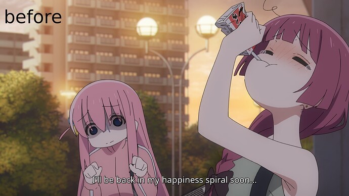
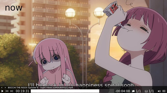
hey hey~
honestly i’m not sure if this is a real issue or intentional design - i’m on kde on x11 and i updated the dejavu fonts (the default ones i think?) today and suddenly they look pretty bad. in the browser it’s a subtle difference but it’s not as sleek as it used to be.

the biggest hit was taken by mpv which now lost its compact look and looks more like if it was designed for the elderly, with strong interface and huge subtitles (i know it’s configurable but i let my system decide what to do and it was okay, now it’s ugly)
are the dejavu fonts now supposed to be like that? i’m not sure whether this is intended or if i somehow messed up and broke something.

