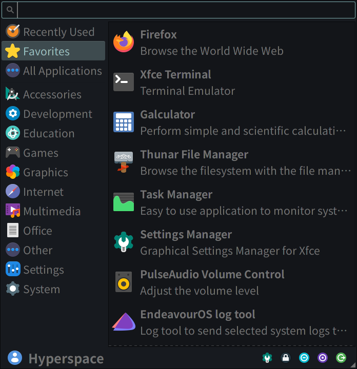
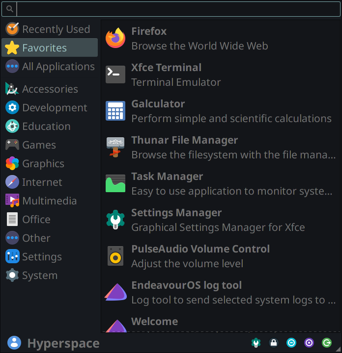
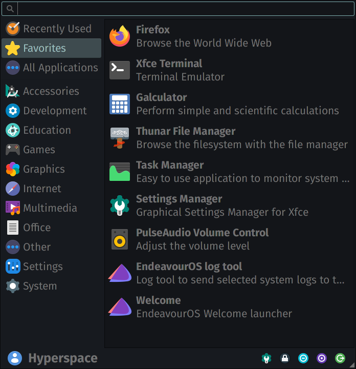
When I switch the “Default Font” within “Settings > Appearance > Fonts”, there is a significant difference in line spacing, even between the same font family. I would like to know if there’s any way to increase line spacing in Xfce. Consider the effect of the following fonts below on line spacing, while remaining at size 16 (same GTK theme throughout):
Noto Sans CJK JP Regular
Noto Sans Regular
Fira Sans Regular
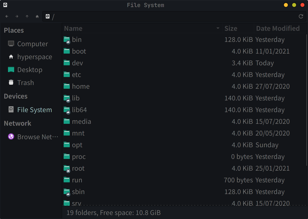
This difference in line spacing/padding is very prominent in Thunar’s “List View”, but generally happens across the whole system. I like the cozy, spacious look of Noto Sans CJK JP Regular, but when switching fonts (e.g. Fira) everything gets extremely cramped! Increasing the font size beyond 16 doesn’t quite solve the line spacing/padding issue.
Is this possible somehow through Xfce settings (like 1.0, 1.15, 1.5, etc. in LibreOffice), some other way, or can this only be done by editing the OTF/TTF/etc. files directly?
Line spacing is fundamentally a property of the font you’re using.
Even at the same type size, line spacing will vary from typeface to typeface.
Since we cannot easily change the line spacing in the font definition, a better solution would be first to settle on the font you want to use and then change the padding property of specific GTK objects within an application. You can specify the padding by writing CSS rules in this file:
~/.config/gtk-3.0/gtk.css
(Create the file if it doesn’t exist already.)
For example, the following CSS rules specify the padding for the buttons in your Whisker menu:
Shouldn’t be, as in the 3 example screenshots above I’ve kept the theme constant.
Though I understand that the GTK theme itself does change the paddings perceptually as well, so I’ll amend my original post to remove that potential source of confusion!
Thank you, that definitely did the trick! My whisker menu looks much better now.
However, is it also possible to increase the padding/line spacing between the application name and its description? E.g. between “Firefox” and “Browse the World Wide Web” in my screenshot above.
On the other hand, is a similar trick applicable to Thunar’s “List View”, as that still remains very cramped? Zooming in/out changes the icon sizes as well, and still doesn’t improve the line spacing issue.
Could this be done with something like:
window#thunar-window view {}
Where I can replace thunar-window with any desired application?
doesn’t quite work as that’s for “Icon View”. I can’t find the original Icon View Row/Column spacing parameter on the page through Gtk Inspector, much less List View’s parameters!
I’m not seeing a cramped view in ‘list view’ - it appears to be double spaced, increasing proportionately if the mini-icon size is increased. I wonder if I have something already set (unknown) that helps? How tight is the spacing in list view for you?
As far as I know, there is no way through CSS to change the spacing between application name and description.
If the Whisker menu designers had placed the name and description in separate GTK objects, then we could apply padding to these objects. However, it seems that the name and description belong to a single object, separated by only a line break. As there is no line-height property for GTK objects, it seems that we cannot change the spacing between lines.
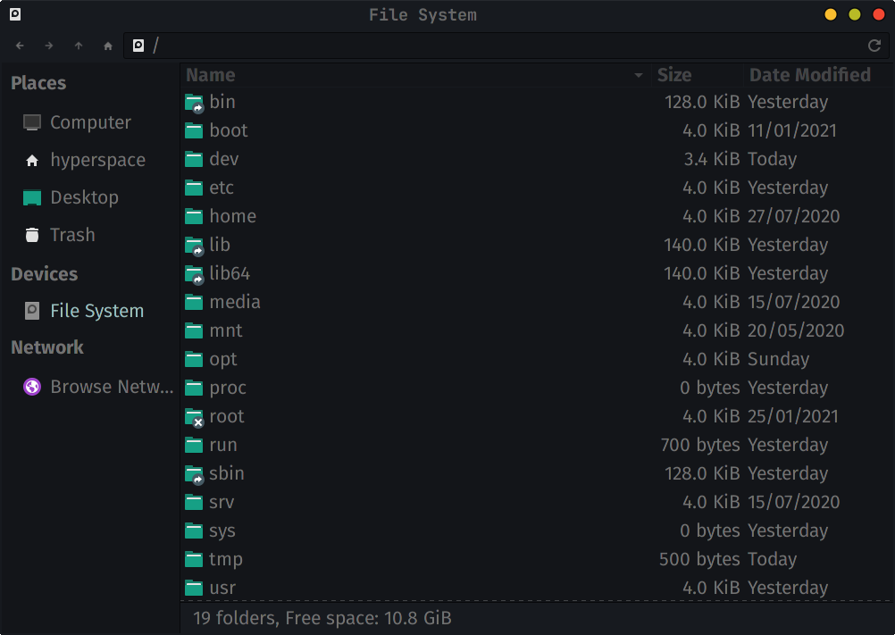
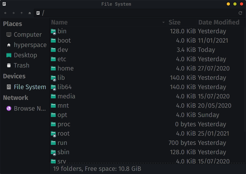
Here are my two Thunar List Views, both with the same GTK theme and font size of 16:
Noto Sans CJK JP Regular:
Fira Sans Regular:
Now that I actually took screenshots and flicked between the 2 quickly, it seems like the smaller size of Fira itself might contribute to the cramped view? I’ll try raising Fira’s font size instead to perceptually match Noto CJK’s and see if the line spacing improves.
So I’ve increased Fira’s font size to 20:
So the “srv” folder does align properly with the first screenshot of Noto Sans CJK JP Regular, but it’s no longer at the same perceptual font size. Which isn’t what I wanted initially! This also causes my entire interface to bloat up like a balloonfish.
I tried peering at the space between the Name and Description, and the space in between looks roughly proportional to the font used, to my eyes. Short of measuring it, I’ll just assume that’s simply the case so I have one less thing to obsess over!