My system language is English, but I want Japanese Kanjis to be displayed correctly, not in the weird Chinese form, which seems to be the default. So, I installed noto-fonts-cjk-jp-vf which says “Google Noto CJK variable fonts with Japanese as the default language”, and set it as the default fonts in Tweaks.
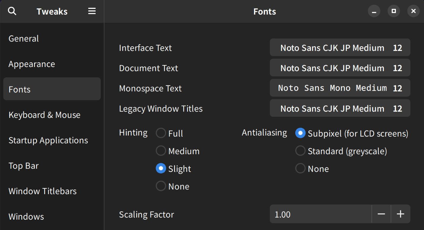
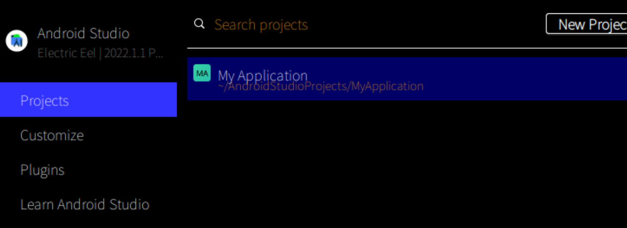
The problem is that QT or Java apps are rendered with very thin, illegible fonts. See Android Studio, for example, with default font settings. It does not matter whether I set “… Medium” or “… Bold” in Tweaks.
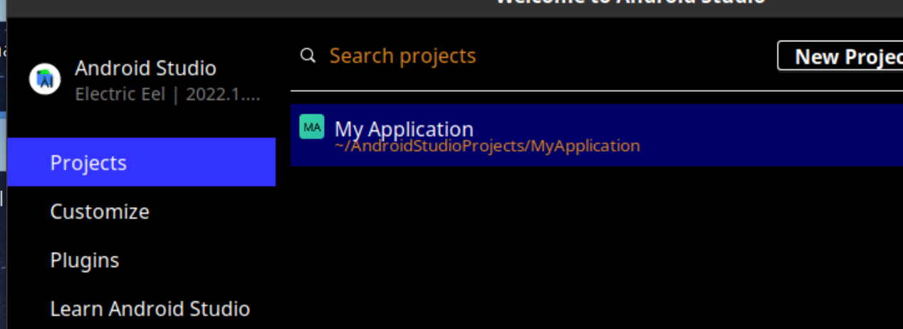
If I set it to “Noto Sans Medium”, then Android Studio looks normal like below:
For QT apps, I solved the problem by installing QT6CT and in its “Select Font” dialogue choosing “Medium”.
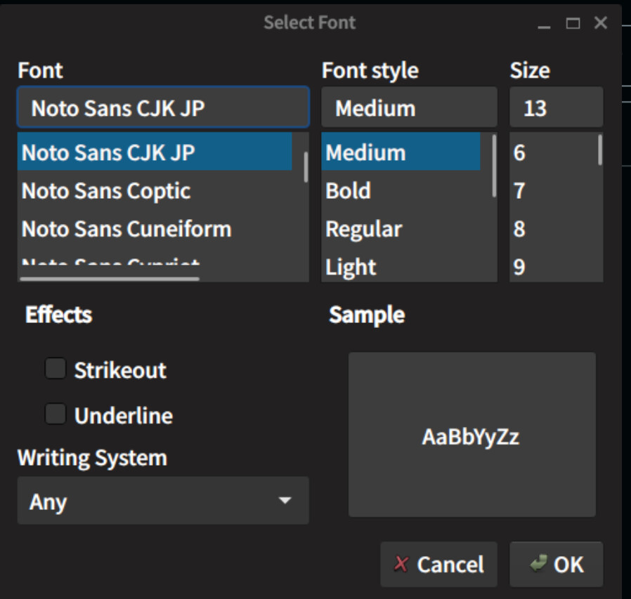
but I do not know how to solve this issue for Java apps. One thing I have noticed is that in QT6CT’s dialogue, “Noto Sans Medium” is in the Font list, but there is no “Noto Sans CJP JP Medium”. There only is “Noto Sans CJK JP”, this is different from Gnome’s font dialogue where there is such a font name
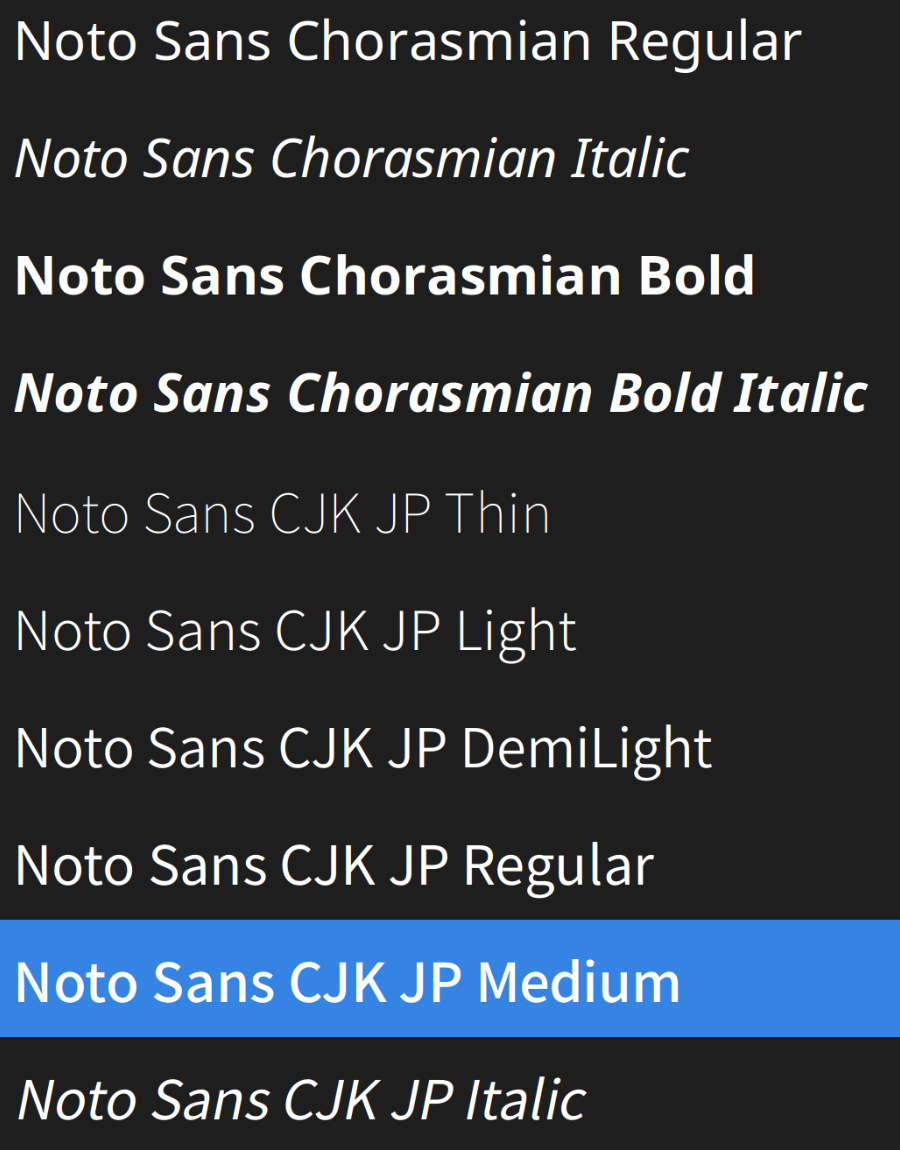
My guess is that even though I set “Noto Sans CJK JP Medium” in Tweaks, non-GTK apps ignore the “Medium” part and just use “Noto Sans CJK JP” with the font’s thinnest weight. If so, is this a bug of the font? Or a bug of the Gnome desktop environment? Or is it because this is a new standard and QT/Java apps are not supporting it?
Also, is there any workaround for me as a user to solve this issue for my system?