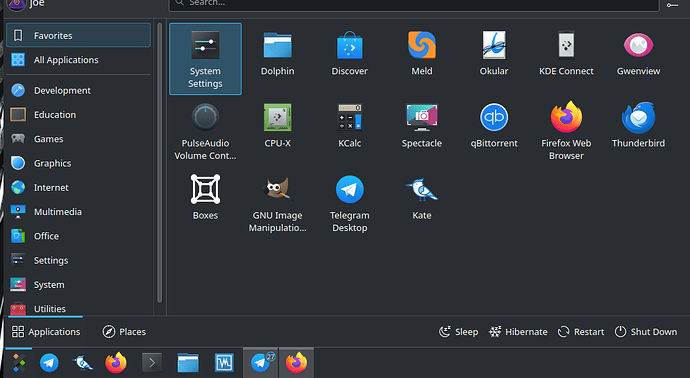
I am SO glad I found this, - I’ve struggled to figure out what that new icon is and it’s not associated in my head with the application at all. Thanks for the clear and easy walkthrough!
1 Like
I think I figured it out:

Pretty clever, I must say…
Still, it’s butt-ugly.
4 Likes
Tyson Tan does some great work imho, but beauty is subjective but separate to design, and design-wise, I never felt this icon really connected to Kate in terms of what its function was. I’m using the icon for “preferences-releasenotes” but it’s clearly a text document.
Stylising icons work great when there’s a known brand and it associates clearly to the name, it’s a shame it hasn’t quite “klicked for Kate”.

2 Likes

