Is this okay?
![]()
Maybe some more spacing between the icons?
Is this okay?
![]()
Maybe some more spacing between the icons?
I think i would go for no margin below the white of the focused window. You might need something like margin-bottom: -3 ?
It seems like [2] is wider than [3]?
Won’t that look a bit weird - it’s just sticking to the bottom
![]()
You are right.
@morten-b I think if we’re ok with that pic, with slighlt decreases line so 2 and 3 look the same I will push that?
Go for it!
Am I right thinking that other than fixing any bugs we are finished on our side??
I think we are. I would like to try to run it on my computer instead of VMs to give it a popper test, but I can’t right now since I need to have i up and running for work and exam. But testing it is 
@joekamprad Would you have any input on what we would need to do right now?
maybe lockscreen ? use if you want…
" https://github.com/Shjim-Arch/Files/blob/main/sway-lock-test.png "
That is being used straight away 
Suggestion for new wofi style:
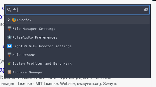
Trying to use these colors. We should also make a seperate wofi config for the power menu.
Hmmmm… why those colours. As much be close to sway as we can we also wanna to follow endeavour os. Purples… like the rofi in i3. We can tone down on the colors sure on the original but I do wanna stick to the purple theme if that is ok 
Yes we do need a a different config for power send screenshot menu.
Summing like that.
Well, because of the Arc-Dark theme. So we follow the same colors across. I’ve tried with the waybar aswell

That makes sense.
We have opposite thoughts on this one.  . (Yes I have reduced the padding on waybar I forgot to push it ).
I’m not keen on it. Perhaps we ask the the people who might use it. @freebird54 @anon75994754 @anon53396576
Do u want to change the style of waybar back?? Im up for that one?
I think its also about the EndevoursOS as a whole. It makes sense to try to keep a somewhat consistent look across the different DEs/WMs.
Anyway, if we don’t take notice of the colors, how do you like the padding and margins of wofi? And also, just, no keeping the waybar completly black, and maybe going for the purple for the active window?
Yeh those a better, it looks nicer.