Well the noob way to play…
launch firefox-nightly -p and create two new profiles.
first - proton-default' which you won't touch, and has no 'chrome' folder... then your user (separate name to firefox) Nightly-Ben’ for the Nightly browser. Then ‘Nightly-test’ which you should clone ‘Nightly-Ben’ and edit to test.
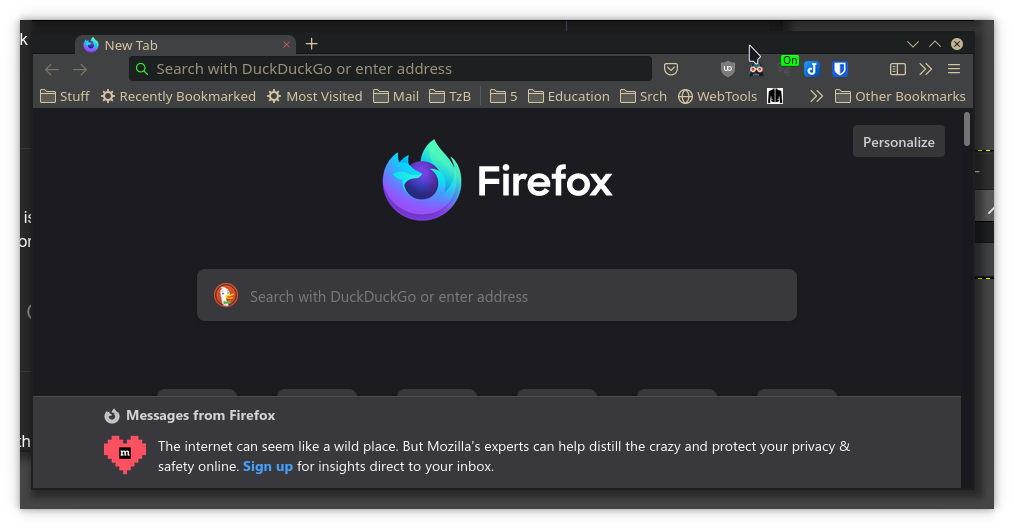
Then you can open different profiles side by side…
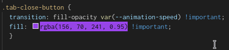
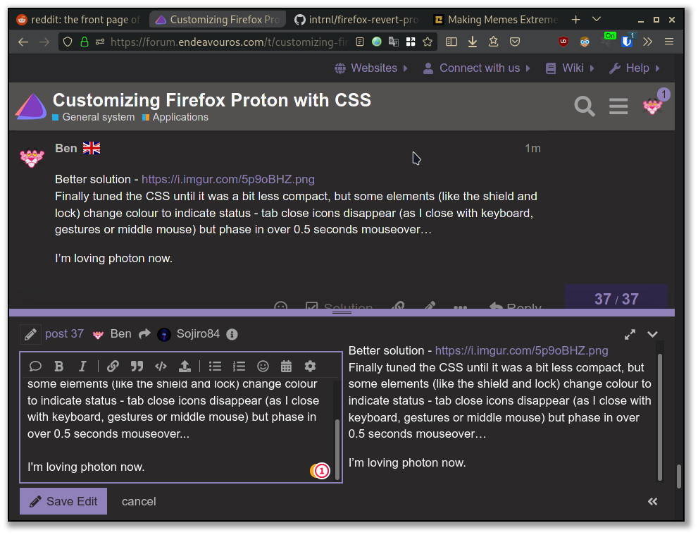
Fun stuff - set the colour of close ‘x’ on tabs:
/* Show Tab Close buttons only when hovered  */
  .tab-close-button {
    transition: fill-opacity var(--animation-speed) !important;
    fill: rgba(255, 75, 75, 0.95) !important;
  }
It’s red now, but purple or pink is good…
Nice fade in for the x.
  .tabbrowser-tab:not([pinned]):hover .tab-close-button {
      display: -moz-box !important;
      max-width: 20px !important;
      opacity: 1 !important;
      transition: all 550ms ease-in-out 550ms !important;       /* delay on entry*/
  }
Change the tab shape - top r/bottom left and top left/bottom right curve is set under :root
` --tab-border-radius: 8px 3px !important;’
You can set 0px for square tabs
or 8px 8px for rounded, or 8px 0px for teardrop etc.
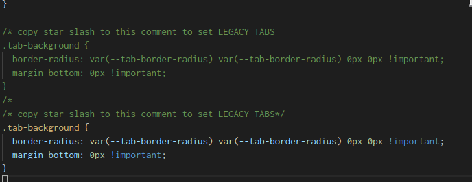
Now you prefer ‘Legacy Tabs’ you open my (new) CSS file and you’ll find it there, I put a comment. You have to move the /* tab up to the ‘comment’ line because now the code is commented out.
I’m trying to make it noob and idiot proof (for my benefit) - so here you see I pasted the comment twice - the green has the /* underneath to comment out the whole thing.
CSS now
/*
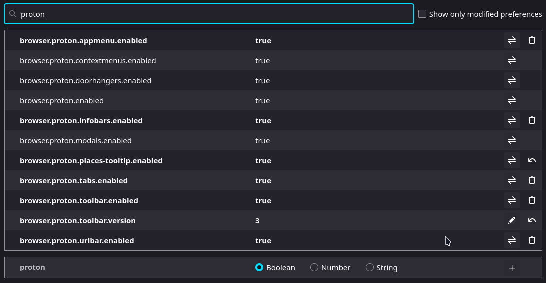
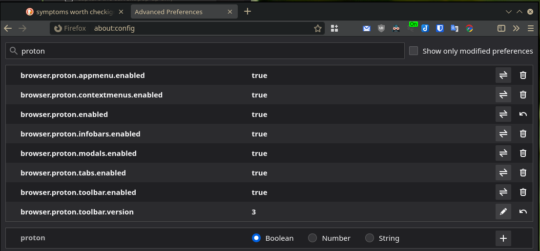
Set Firefox toolkit.legacyUserProfileCustomizations.stylesheets --> TRUE
*/
:root{
--toolbarbutton-inner-padding: 4px !important;
--proton-tab-block-margin: 2px 3px !important;
--tab-min-height: 24px !important;
--tabs-shadow-size: 0px !important;
--tab-border-radius: 8px 3px !important;
--arrowpanel-menuitem-padding: 5px !important;
--panel-font-size: 1.0em !important;
--arrowpanel-padding: 0.4em !important;
--arrowpanel-dimmed: color-mix(in srgb, #1ae0ff 35%, transparent) !important;
--arrowpanel-dimmed-further: color-mix(in srgb, #1ae0ff 40%, transparent) !important;
--arrowpanel-dimmed-even-further: color-mix(in srgb, #1ae0ff 45%, transparent) !important;
--urlbar-icon-padding: 4px !important;
--arrowpanel-menuitem-padding: 4px !important;
--panel-font-size: inherit !important;
--arrowpanel-padding: 0.8em !important;
}
/* copy star slash to this comment to set LEGACY TABS
.tab-background {
border-radius: var(--tab-border-radius) var(--tab-border-radius) 0px 0px !important;
margin-bottom: 0px !important;
}
/*
/* Reduce left spacer on tab bar */
.titlebar-spacer[type="pre-tabs"] {
display: none !important;
}
/* Show Tab Close buttons only when hovered */
.tab-close-button {
transition: fill-opacity var(--animation-speed) !important;
fill: rgba(255, 75, 75, 0.95) !important;
}
.tabbrowser-tab:not([pinned]) .tab-close-button {
max-width: 0px !important;
opacity: 0 !important;
transition: all 250ms ease-in-out 250ms !important;
/* no delay on exit*/
}
.tabbrowser-tab:not([pinned]):hover .tab-close-button {
display: -moz-box !important;
max-width: 20px !important;
opacity: 1 !important;
transition: all 550ms ease-in-out 550ms !important; /* delay on entry*/
}
/* LEGACY audio icon next to the tab icon - comment out the tab-secondary-label */
.tab-icon-stack:is([muted],[soundplaying],[activemedia-blocked]){
grid-template-areas: "a s";
}
.tab-icon-overlay:is([muted],[soundplaying],[activemedia-blocked]){ grid-area: s; }
.tab-icon-overlay,.tab-icon-image{ opacity: 0.75 !important; }
/* secondary audio label can be removed if you use this style, but feel free to remove the next line if you want to show it. */
.tab-secondary-label{ display: none }
/* show the secondary label when video is in PiP */
.tab-secondary-label[pictureinpicture]{ display: -moz-box }
.tab-secondary-label:is([pictureinpicture]) {display: -moz-box !important; margin-top:-1px !important; color:#00dbfd !important;
font-size: 0.65em !important; font-weight: bold !important;text-shadow: 0px 0px 5px #000000 !important}
.tab-secondary-label:is([muted], [activemedia-blocked]) {display: none}
.tab-close-button{margin-inline-start: -2px !important;width: 15px !important;height: 15px !important;padding: 3px !important; margin-inline-end:-6px !important}
#tabbrowser-tabs{ --uc-tabs-scrollbutton-border: 2px }
#scrollbutton-up, #scrollbutton-down{ border-block-width: var(--uc-tabs-scrollbutton-border,0px) !important; }
.sharing-icon, #permissions-granted-icon, #tracking-protection-icon, .notification-anchor-icon, #blocked-permissions-container
>.blocked-permission-icon { heigh: 14px !important; width :14px !important;}
#identity-icon{color: #2cf62c !important; heigh: 14px !important; width :14px !important}
.urlbar-icon {padding: 4px !important}
.PanelUI-subView toolbarseparator.proton-zap {border-image: var(--panel-separator-zap-gradient) 1;}
.tab-context-line{max-width: 17px !important; max-height: 1px !important; margin-left: 8px !important;margin-bottom: -1px !important;}
.tab-context-line{-moz-box-ordinal-group: 2 !important; opacity: 1 !important;transition: none !important;}
.identity-color-blue {--identity-tab-color: #2574A7 !important; --identity-icon-color: #2574A7 !important;--tab-line-color:#295170 !important;}
.identity-color-green {--identity-tab-color: #1E934F !important; --identity-icon-color: #1E934F !important;--tab-line-color:#20834b !important;}
.identity-color-orange {--identity-tab-color: #e67e22 !important; --identity-icon-color: #e67e22 !important;--tab-line-color:#a9642c !important;}
.identity-color-red {--identity-tab-color: #ff392b !important; --identity-icon-color: #ff392b !important; --tab-line-color:#cc372f !important;}
.identity-color-pink {--identity-tab-color: #ff33bb !important; --identity-icon-color: #ff33bb !important;--tab-line-color:#e22fa7 !important;}
.identity-color-purple {--identity-tab-color: #813E9D !important; --identity-icon-color: #813E9D !important;--tab-line-color:#703988 !important;}
.identity-color-blue >.tab-stack > .tab-content:not([selected="true"]) .tab-label{color: #1bbfff !important;}
.identity-color-green >.tab-stack > .tab-content:not([selected="true"]) .tab-label{color: #6be19c !important; }
.identity-color-orange >.tab-stack > .tab-content:not([selected="true"]) .tab-label{color: #ebc247 !important; }
.identity-color-red >.tab-stack > .tab-content:not([selected="true"]) .tab-label{color: #ff6666 !important;}
.identity-color-pink >.tab-stack > .tab-content:not([selected="true"]) .tab-label{color: #ff99eb !important;}
.identity-color-purple >.tab-stack > .tab-content:not([selected="true"]) .tab-label{color: #caa4da !important;}
.identity-color-blue> .tab-stack> .tab-content[selected="true"] {background-color:color-mix(in srgb, #2574A7 10%, transparent) !important;
border-radius:0px !important; margin-top: 3px !important; margin-bottom: 3px !important;}
.identity-color-green .tab-stack> .tab-content[selected="true"] {background-color:color-mix(in srgb, #1E934F 10%, transparent) !important;
border-radius:0px !important; margin-top: 3px !important; margin-bottom: 3px !important;}
.identity-color-orange .tab-stack> .tab-content[selected="true"] {background-color:color-mix(in srgb, #e67e22 10%, transparent) !important;
border-radius:0px !important; margin-top: 3px !important; margin-bottom: 3px !important;}
.identity-color-red .tab-stack> .tab-content[selected="true"] {background-color:color-mix(in srgb, #a0392b 10%, transparent) !important;
border-radius:0px !important; margin-top: 3px !important; margin-bottom: 3px !important;}
.identity-color-pink .tab-stack> .tab-content[selected="true"] {background-color:color-mix(in srgb, #ff99eb 10%, transparent) !important;
border-radius:0px !important; margin-top: 3px !important; margin-bottom: 3px !important;}
.identity-color-purple .tab-stack> .tab-content[selected="true"] {background-color:color-mix(in srgb, #813E9D 10%, transparent) !important;
border-radius:0px !important; margin-top: 3px !important; margin-bottom: 3px !important;}
/* Replace the button background-colors with a glow effect */
/* Edit the color choices how you see fit */
/* Make backgrounds transparent */
.close-icon,
.urlbar-icon,
.urlbar-icon-wrapper,
toolbar .toolbarbutton-1,
#tabbrowser-tabs toolbarbutton,
toolbar toolbarbutton > .toolbarbutton-icon,
toolbar toolbarbutton > .toolbarbutton-badge-stack,
.titlebar-button,
#identity-box,
#identity-icon-box,
#tracking-protection-icon-container,
.findbar-textbox~toolbarbutton,
toolbarbutton.scrollbutton-up,
toolbarbutton.scrollbutton-down,
toolbarbutton#scrollbutton-up,
toolbarbutton#scrollbutton-down{
background-color: transparent !important;
border-color: transparent !important;
}
/* Glow effects on hover */
.close-icon:hover,
.urlbar-history-dropmarker:hover,
#page-action-buttons > .urlbar-icon:hover,
.urlbar-icon-wrapper:hover > .urlbar-icon,
toolbar .toolbarbutton-1:not([disabled]):hover .toolbarbutton-icon,
#TabsToolbar toolbarbutton:not([disabled]):hover .toolbarbutton-icon,
toolbar #downloads-button:hover #downloads-indicator-anchor,
#identity-box:not(.no-hover):hover,
#tracking-protection-icon:hover,
.findbar-textbox~toolbarbutton:not([disabled]):hover,
toolbarbutton.scrollbutton-up:not([disabled]):hover,
toolbarbutton.scrollbutton-down:not([disabled]):hover,
toolbarbutton#scrollbutton-up:not([disabled]):hover,
toolbarbutton#scrollbutton-down:not([disabled]):hover{
filter: brightness(2) drop-shadow(0 0 2px rgb(255, 0, 0)) drop-shadow(0 0 1px rgb(255, 0, 0))
}
/* Active states and close window button hover state */
#titlebar .titlebar-buttonbox > .titlebar-close:hover > .toolbarbutton-icon,
.close-icon:active,
.urlbar-history-dropmarker:active,
#page-action-buttons > .urlbar-icon:active,
#page-action-buttons > .urlbar-icon[open],
.urlbar-icon-wrapper:active > .urlbar-icon,
.urlbar-icon-wrapper[open] > .urlbar-icon,
toolbar toolbarbutton:not([disabled]):active .toolbarbutton-icon,
toolbar toolbarbutton:not([disabled])[open] .toolbarbutton-icon,
#TabsToolbar toolbarbutton:not([disabled]):active .toolbarbutton-icon,
toolbar #downloads-button:active #downloads-indicator-anchor,
toolbar #downloads-button[open] #downloads-indicator-anchor,
#identity-box:not([disabled]):active,
#tracking-protection-icon-container[open] #tracking-protection-icon,
.findbar-textbox~toolbarbutton:not([disabled]):active,
toolbarbutton.scrollbutton-up:active,
toolbarbutton.scrollbutton-down:active,
toolbarbutton#scrollbutton-up:active,
toolbarbutton#scrollbutton-down:active{
filter: brightness(2) drop-shadow(0 0 2px red) drop-shadow(0 0 1px yellow)
}
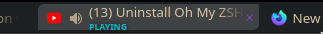
Similarly, I don’t want a second line on tabs showing ‘Playing’ but I don’t mind ‘Picture-in-Picture’ - that’s easy to find. You can have only the audio icon if you like…
 I’m looking forward to Firefox Proton with a little less trepidation now, thanks to your work.